Project Description:
Joanne Wood approached Studio PME to create the identity for her new bakery, Joannes’, with one clear goal: the brand had to reflect her personal values and artistic vision. From the start, she emphasized progressive ideals rooted in her upbringing and a desire to blend those with a playful, expressive tone.
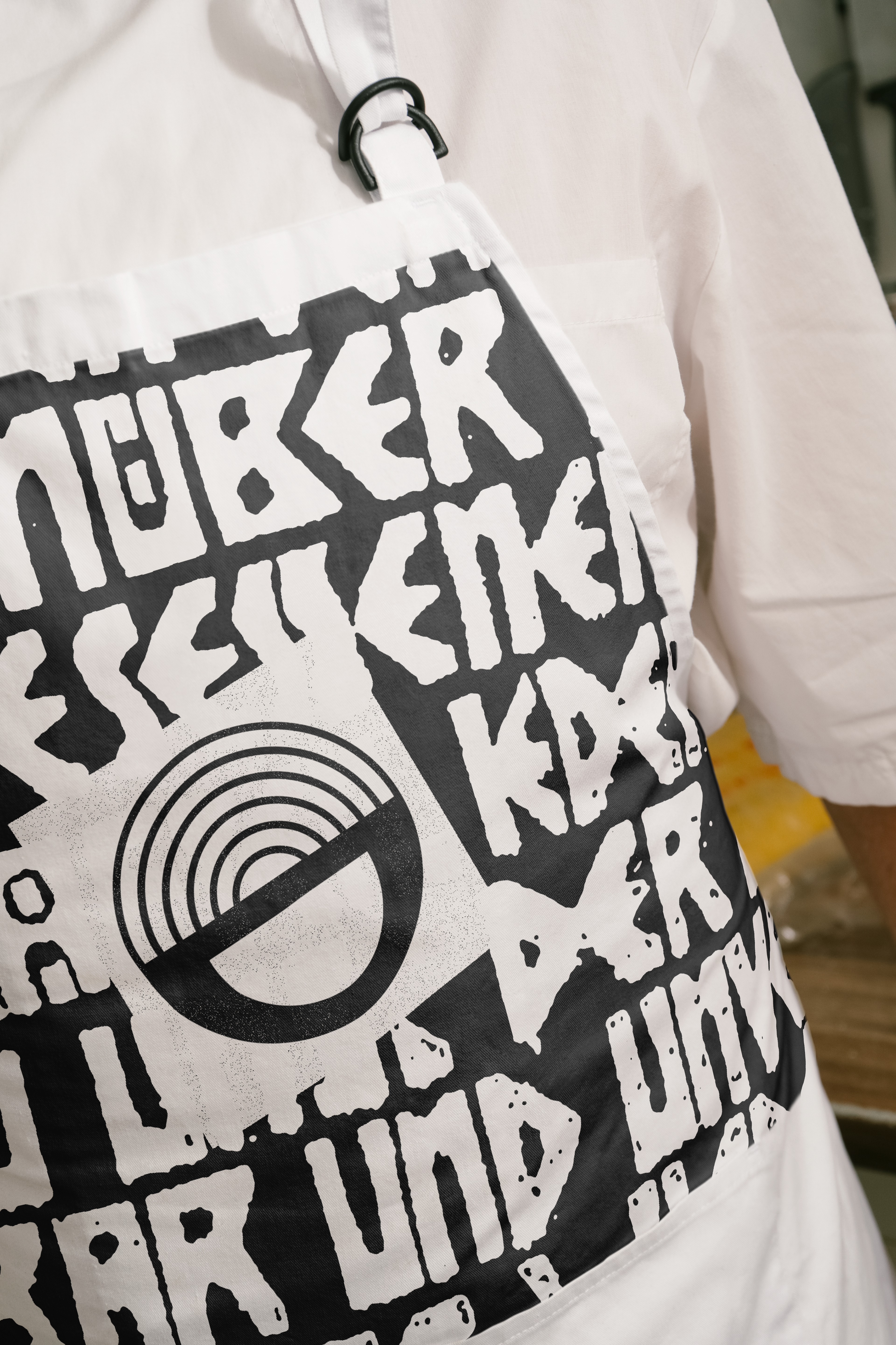
During discovery, we explored not only her background in baking but also her influences from fashion, homeware, and art—particularly German Expressionism. Her admiration for Anselm Kiefer informed the visual direction, pushing us to find a balance between fine art and everyday accessibility.
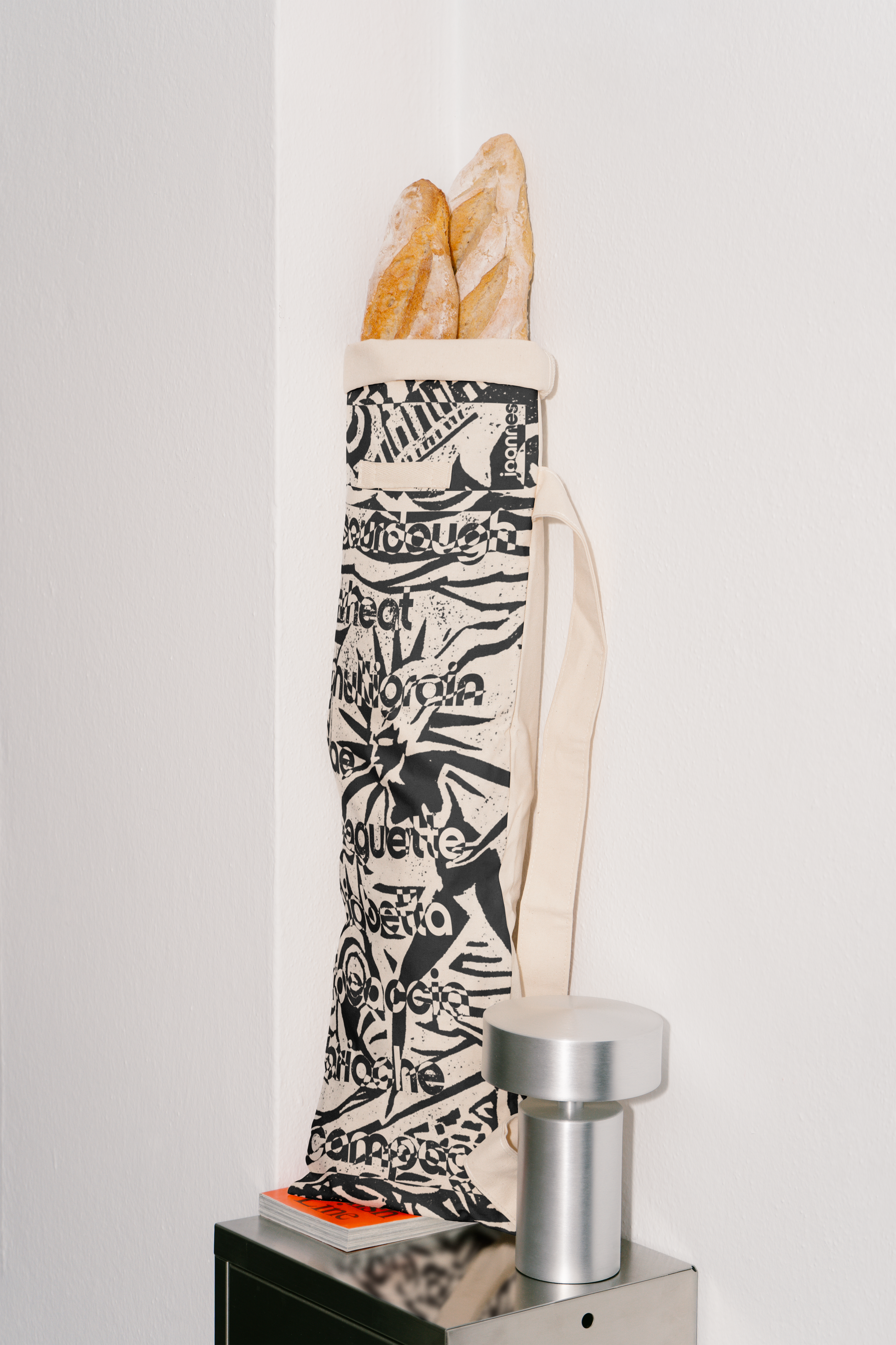
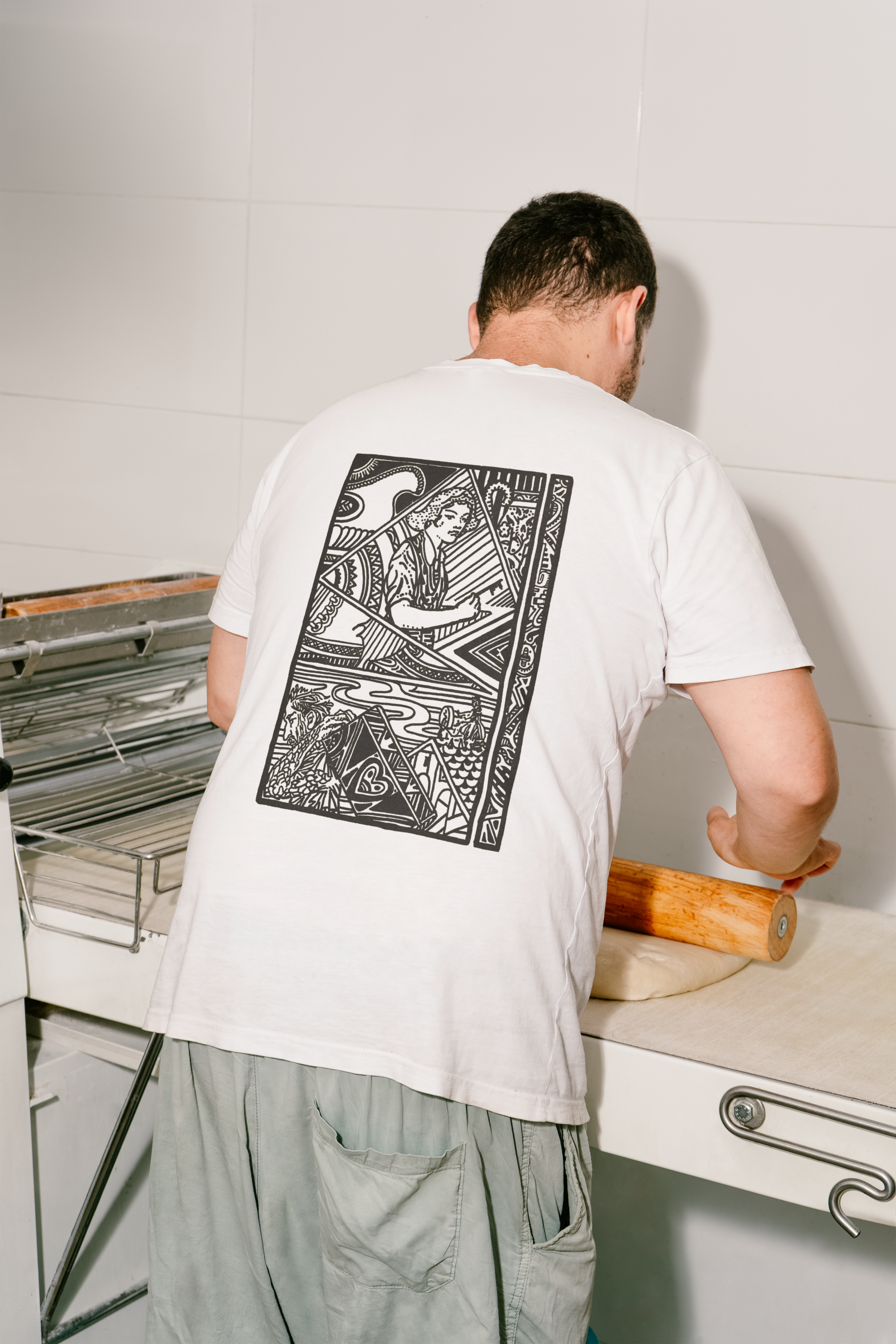
The challenge: create a brand that feels unconventional but inviting. We developed a visual system inspired by archival references, Expressionist forms, and Bauhaus structure—translating these through digital techniques. Typography leaned on Swiss principles, while the logomark merged angular geometry with warmth.
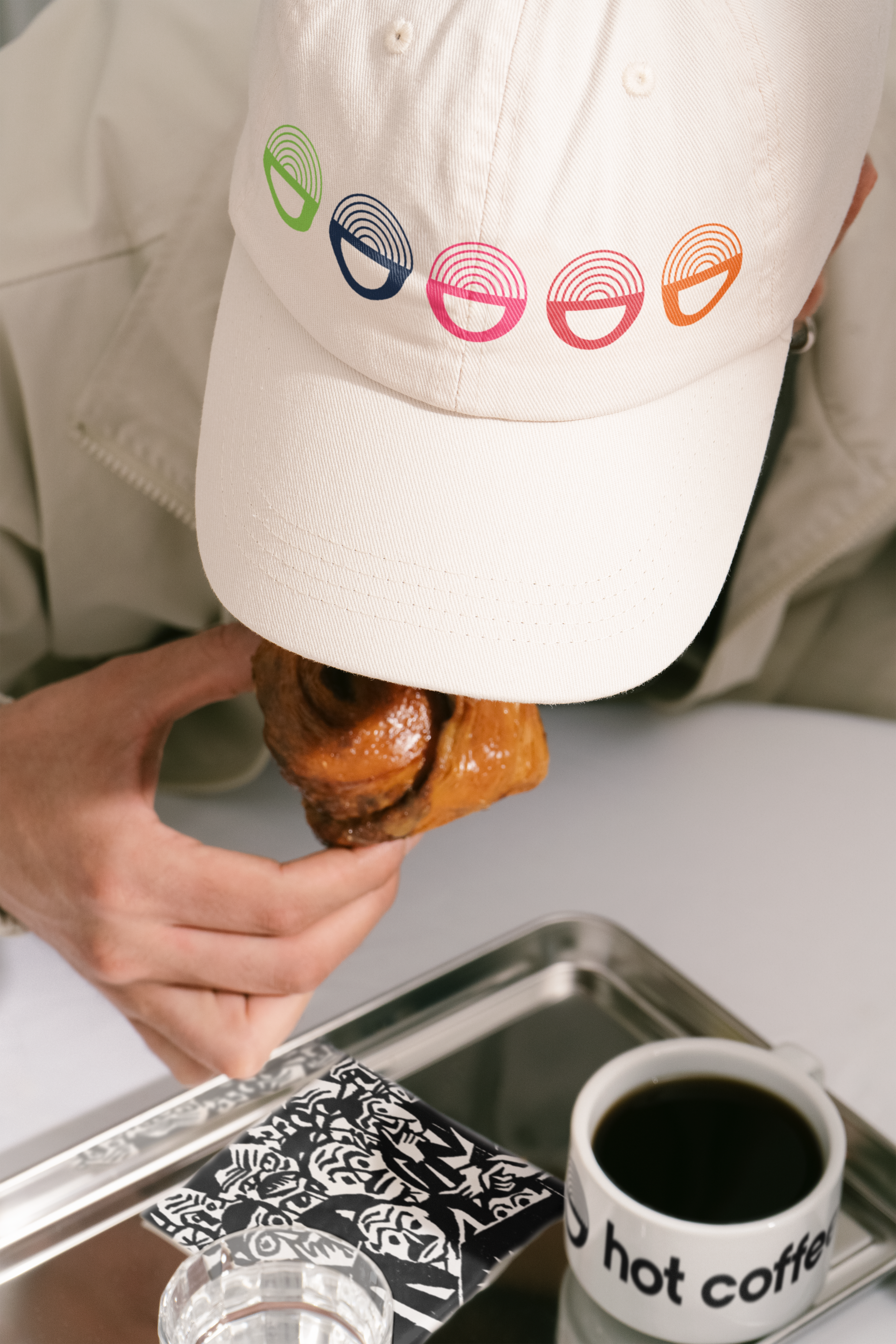
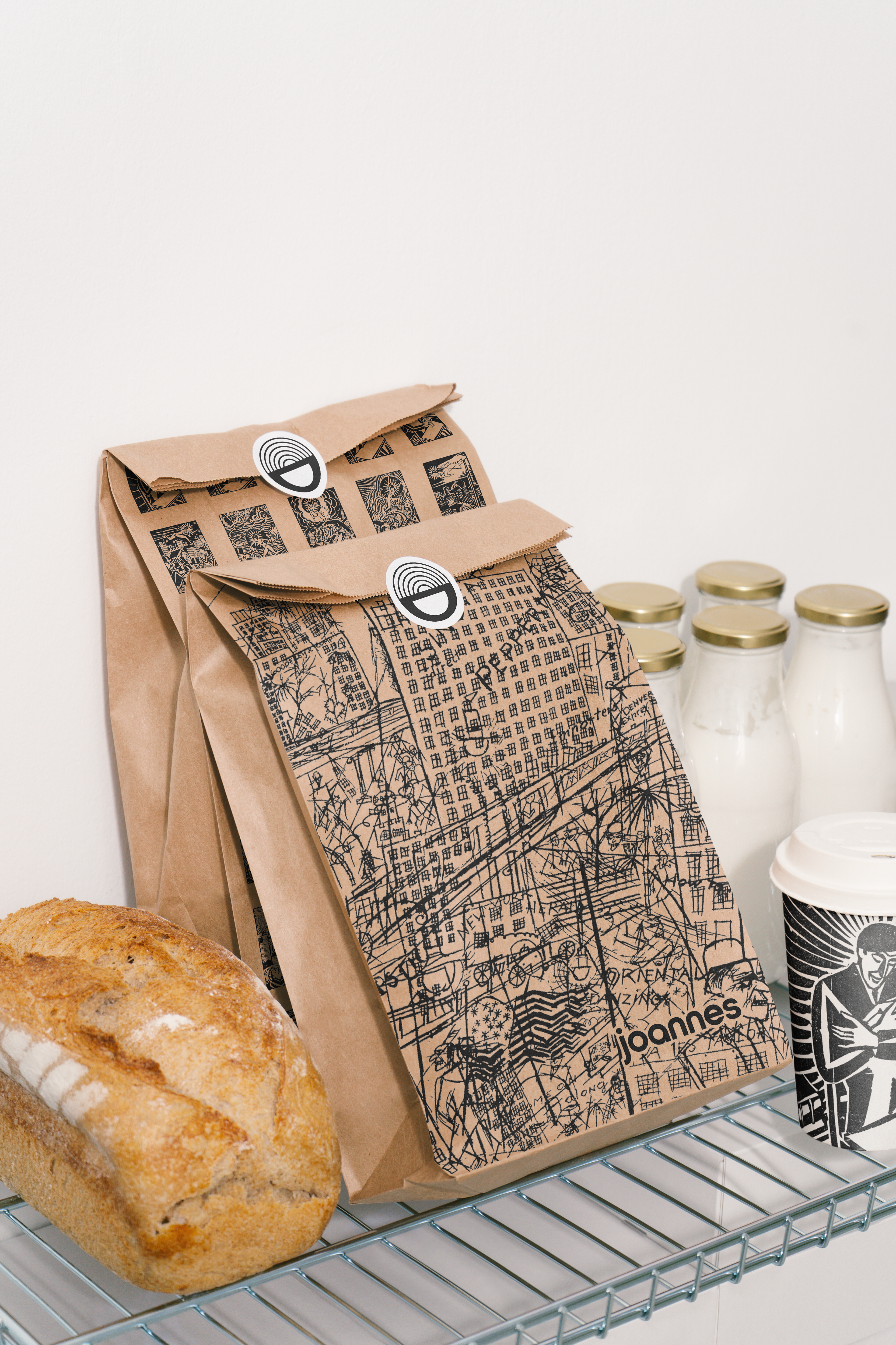
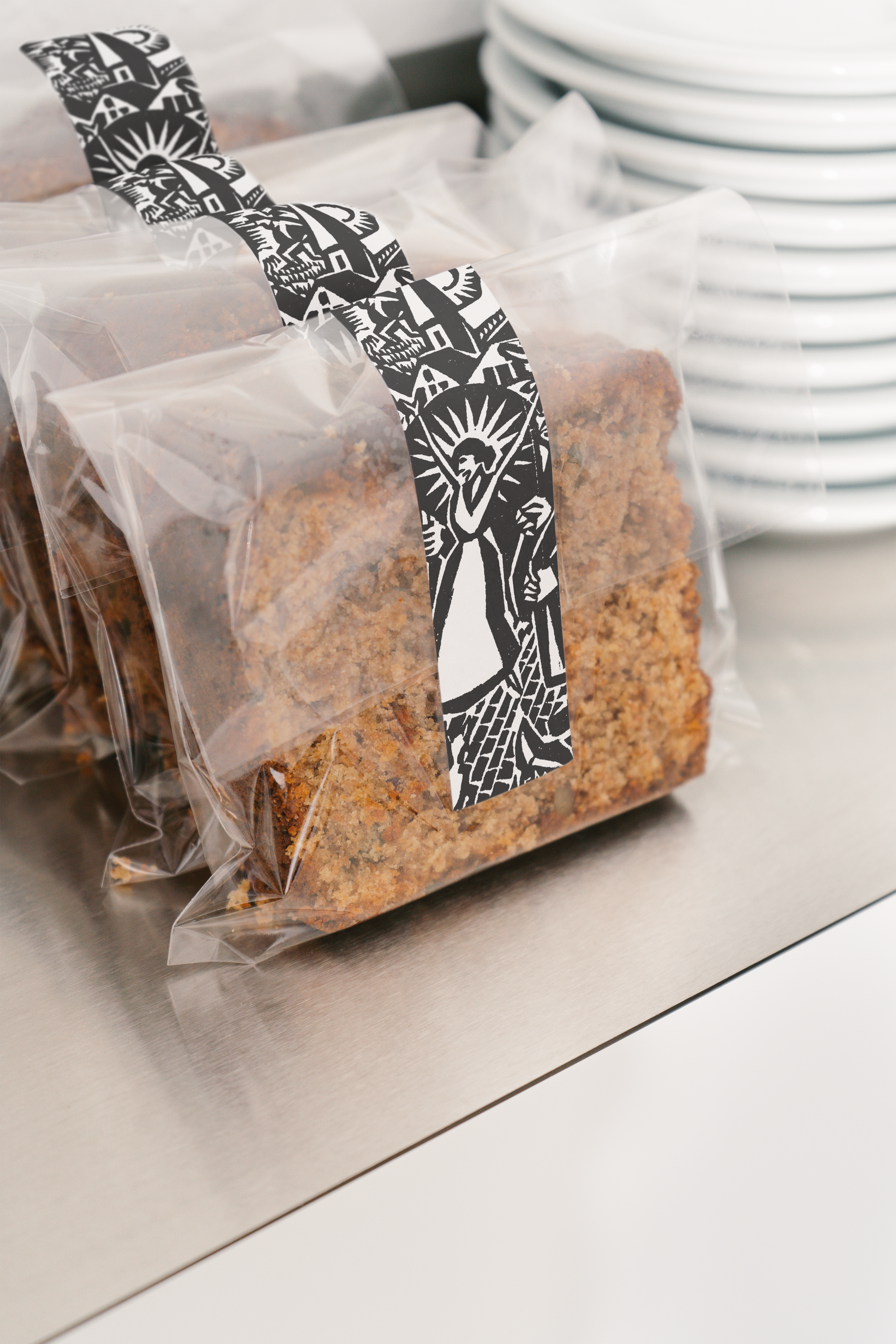
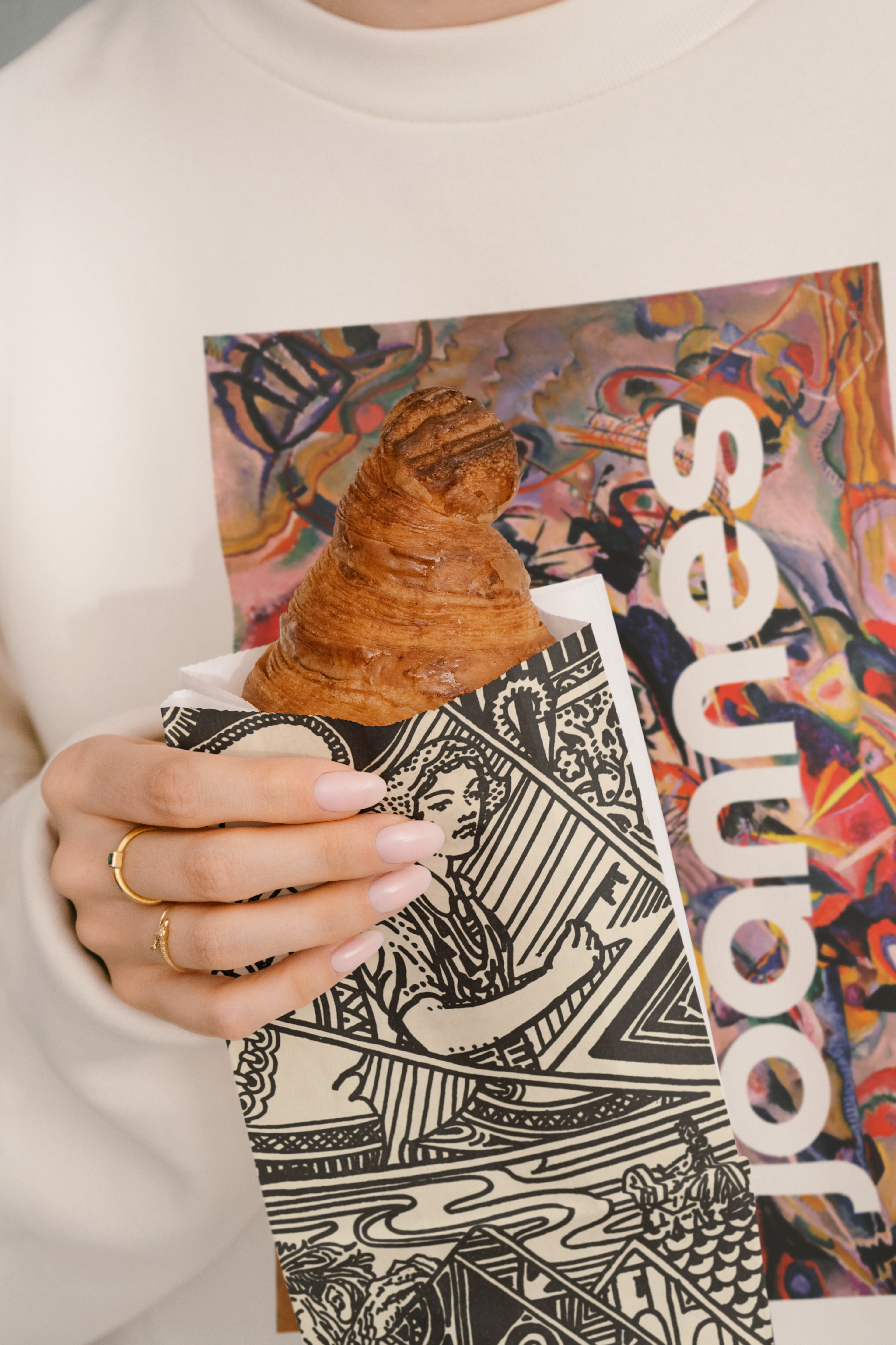
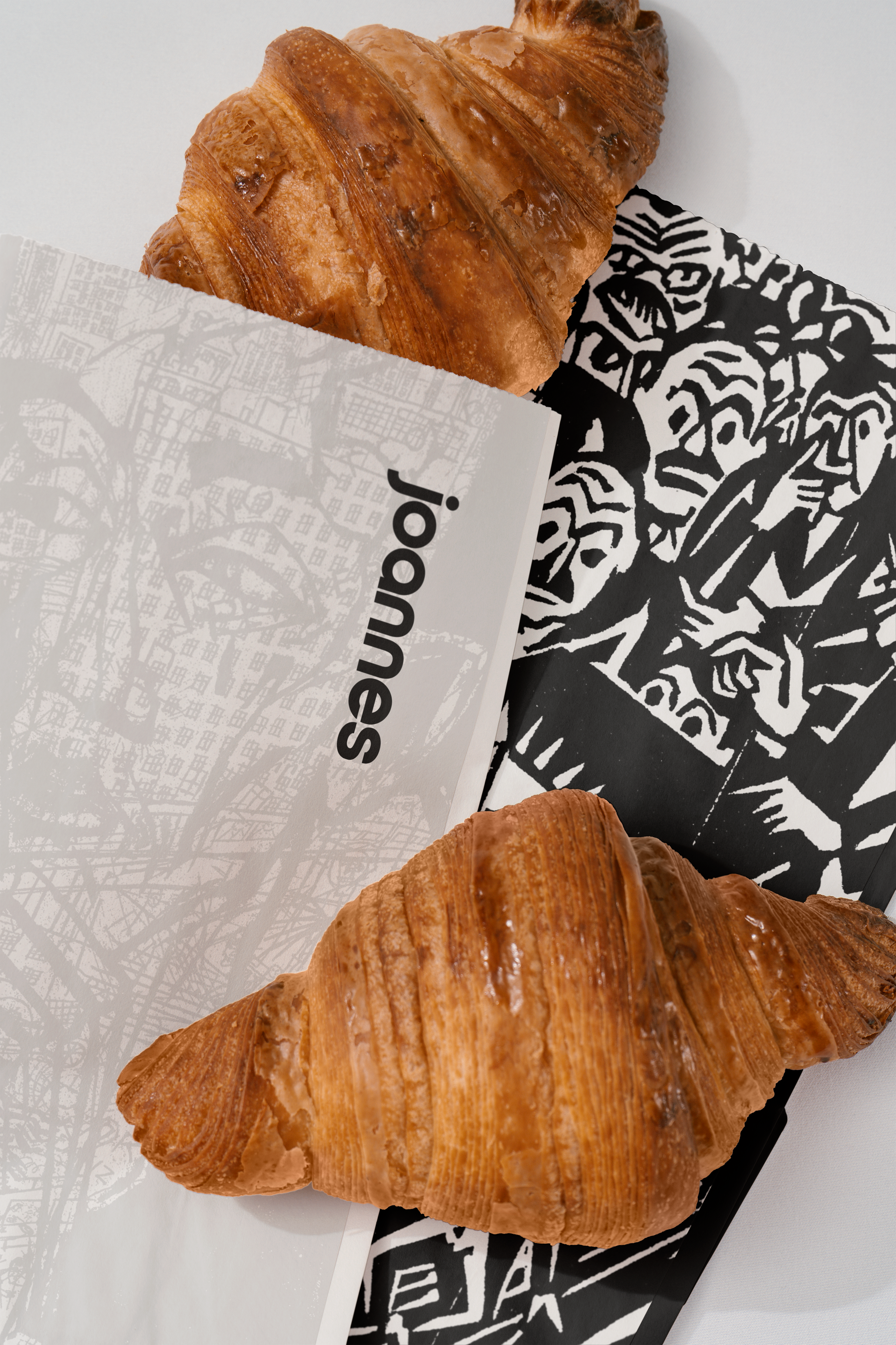
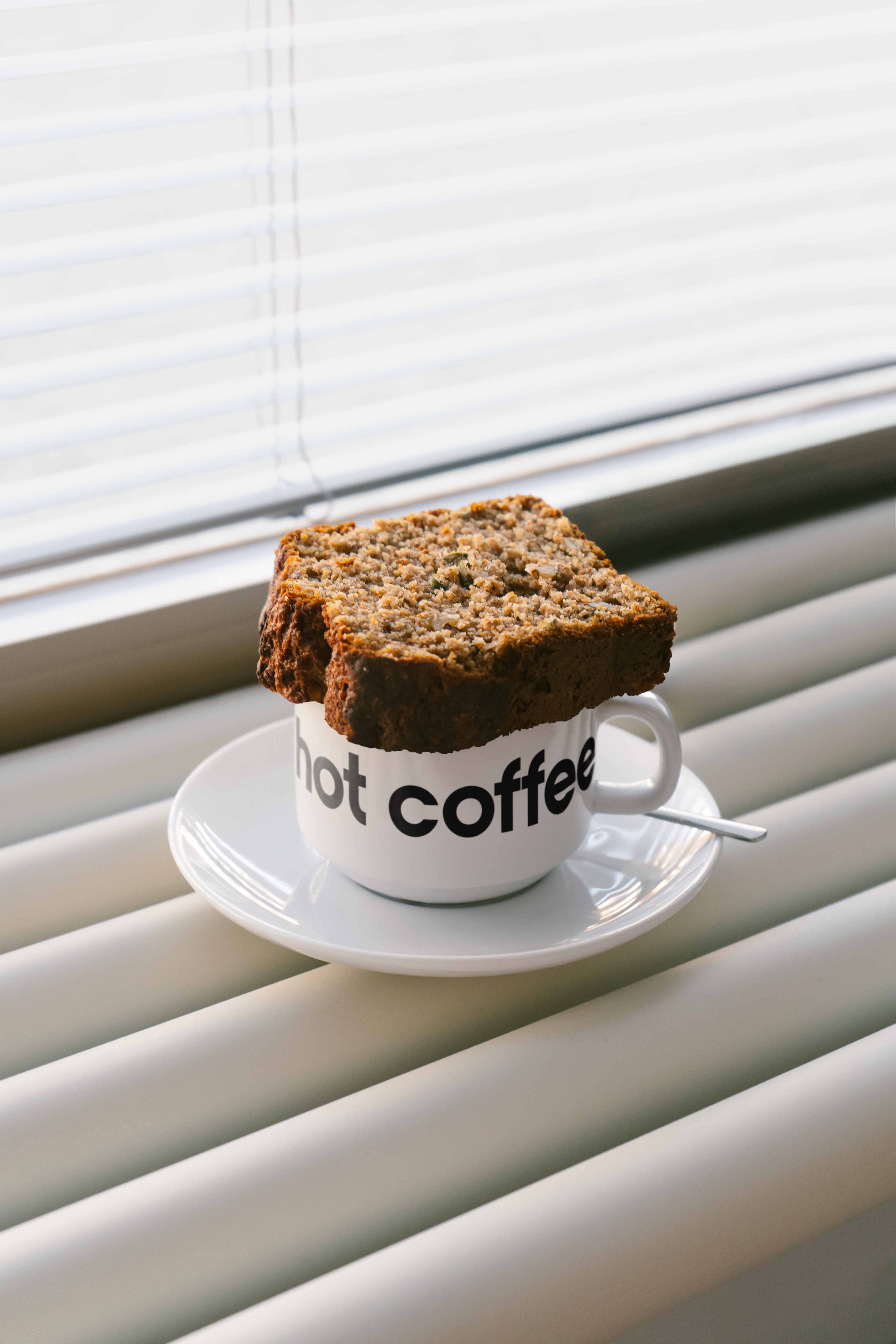
Packaging became a canvas for storytelling. From the baguette bag to storefront elements, each piece played with abstraction, color, and symbolism to reflect the brand’s values and spark curiosity.
Joannes’ reimagines what a bakery can look and feel like. It’s not just about selling bread—it’s about creating an environment where design, memory, and emotion meet.
Design Influences: Anselm Kiefer’s visual language, early 20th-century German Expressionism, Swiss typography, archival print material, and storytelling through color and form.
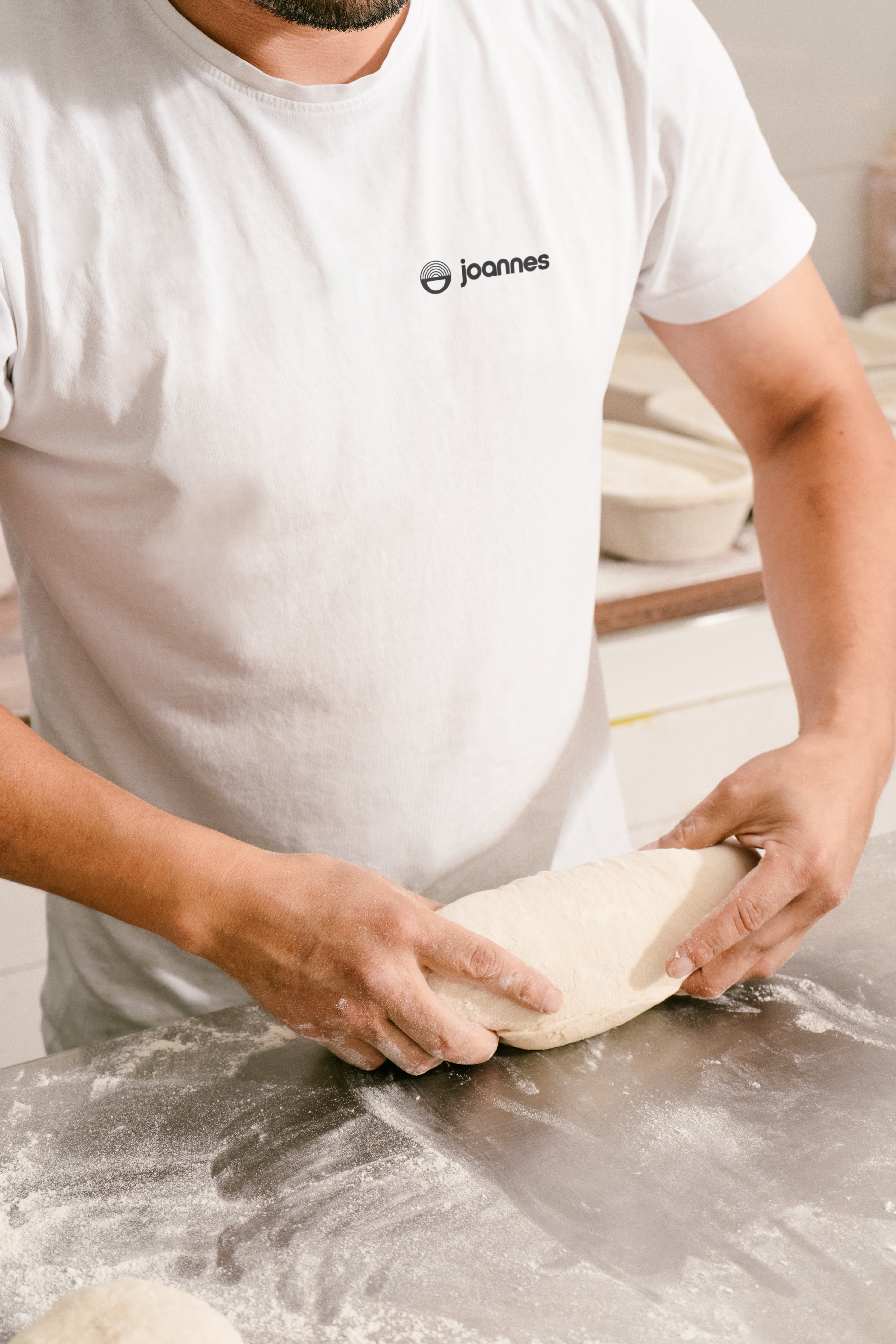
Deliverables: Full visual identity for Joannes’ including logomark, packaging design, typography system, visual concept for store environment, and brand collateral for print and digital use.