Project Description: The Emory Practical Intervention Course, better known as EPIC, is one of the longest-standing and most respected interventional cardiology conferences in the world. Founded in 1981 by Swiss physician Dr. Andreas Gruentzig, the course was groundbreaking from the start—focused on pushing boundaries in coronary and structural heart care.
Studio PME was brought in to lead the rebrand. The goal: honor the legacy of Dr. Gruentzig while repositioning EPIC for a new era, one that reflects innovation, access, and global relevance.
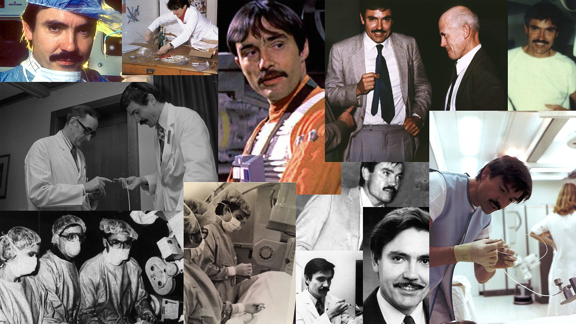
In discovery, we immersed ourselves in Dr. Gruentzig’s life and work—reading archival material, studying historical breakthroughs, and reviewing photographs that captured his intensity and vision. One image in particular stood out. It showed him mid-demonstration, completely immersed in his practice. That passion became the creative north star.We quickly defined a central problem: the original name, Emory Practical Intervention Course, was too long and too formal for the brand’s evolving goals. After conversation with the team, we aligned on using “EPIC”—a name already in informal use, and one that opened up room to explore a more versatile, tech-forward identity.

At first, we considered building the identity around Dr. Gruentzig’s likeness, but it felt too literal. Instead, we shifted our focus to his greatest contribution—developing the balloon catheter. This invention, though humble in form, transformed cardiac care and shaped the future of non-invasive heart surgery.
That story led us to the idea of using wire-like forms in the typography—subtle, structural, and full of tension. We studied type from both established and independent European foundries, looking for shapes that felt clinical but human, precise but approachable.
We also took cues from modernist identity systems, especially the work of Tom Geismar and Ivan Chermayeff. The Chase logo, in particular, served as a reminder of how effective a bold, minimal mark could be across scales and applications.
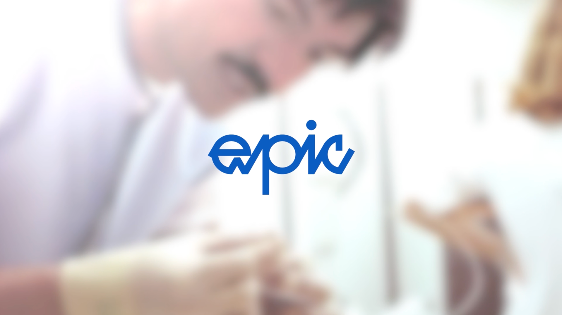
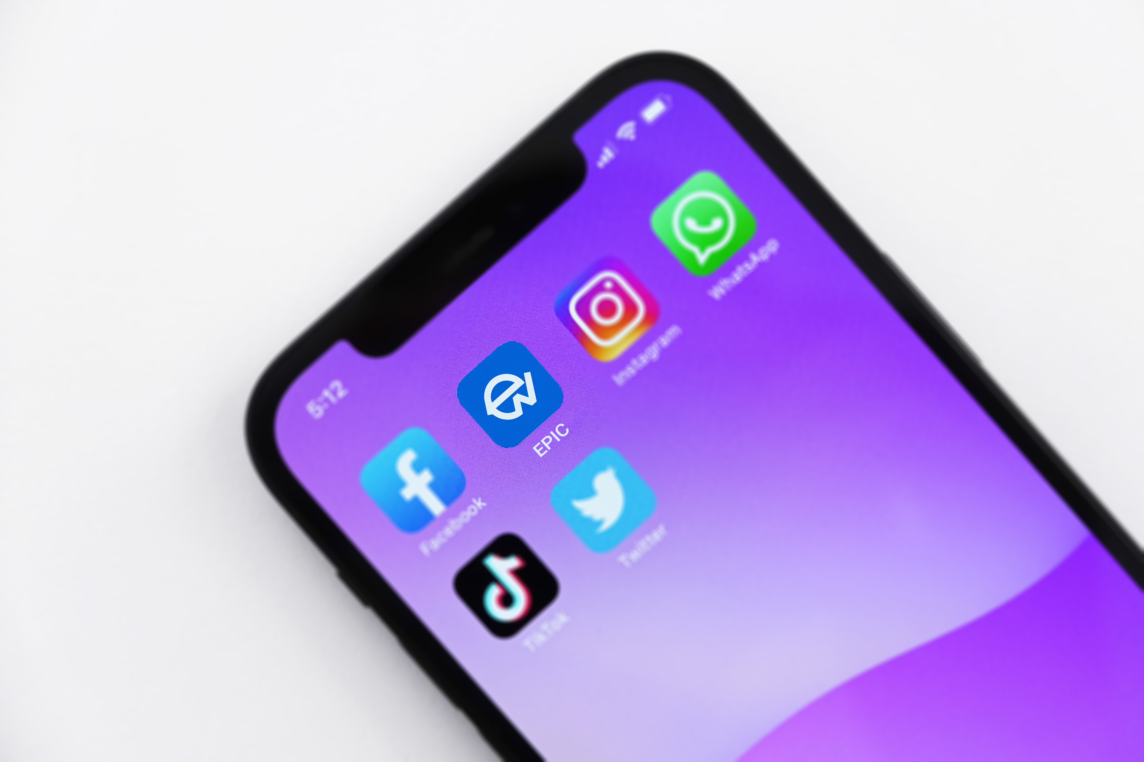
The final identity was built to flex. The full “EPIC” logotype combines calligraphic curves with san-serif stability—anchored yet agile. A standalone “E” version functions as a navicon, app icon, and signature mark. This modular approach was essential, especially with EPIC preparing to launch a free-access mobile app in the months ahead.We kept the palette simple and dignified. Royal blue leads, chosen for its associations with trust, clarity, and calm—values central to both the medical field and the EPIC ethos. The result is a brand identity that bridges past and future, function and story.
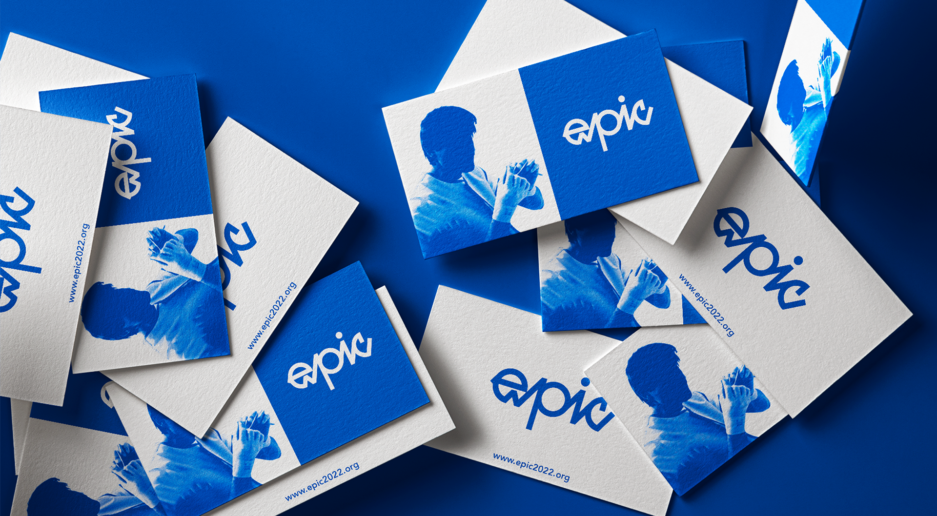
Design Influences: The work and legacy of Dr. Andreas Gruentzig, balloon angioplasty breakthroughs, Tom Geismar and Ivan Chermayeff’s identity systems, European typography, and classic medical color schemes.
Deliverables: Modular brand identity system including logomark, app icon, visual language, custom typography direction, color palette, and scalable logo suite for print and digital use.