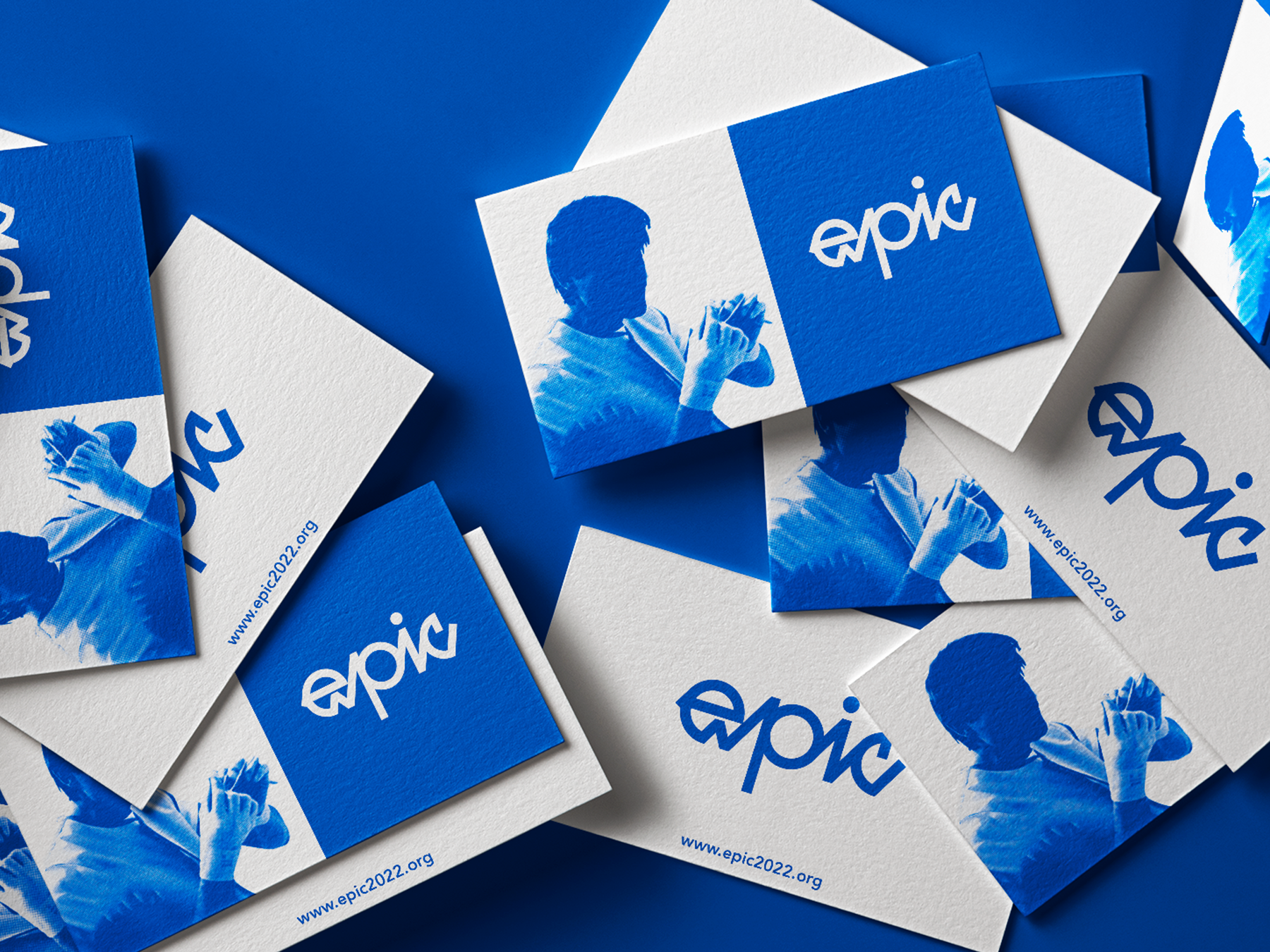
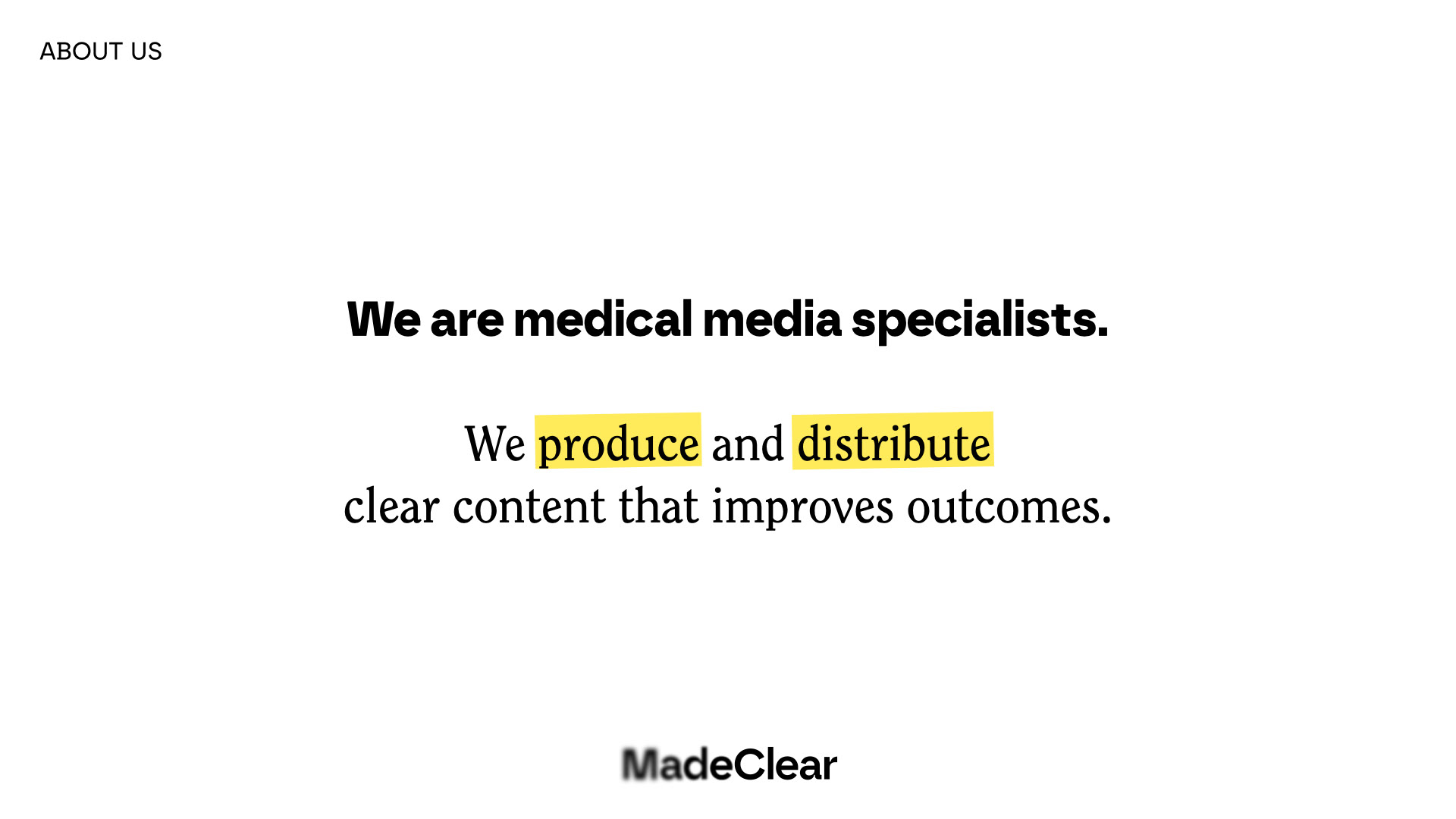
Project Description: In collaboration with Croma Studio, we helped develop the introductory investor deck for Made Clear Studios—a new media production company focused on clarity, creativity, and human-first storytelling. The goal was to build a visually precise and emotionally resonant deck that could communicate the startup’s mission, direction, and value to investors.
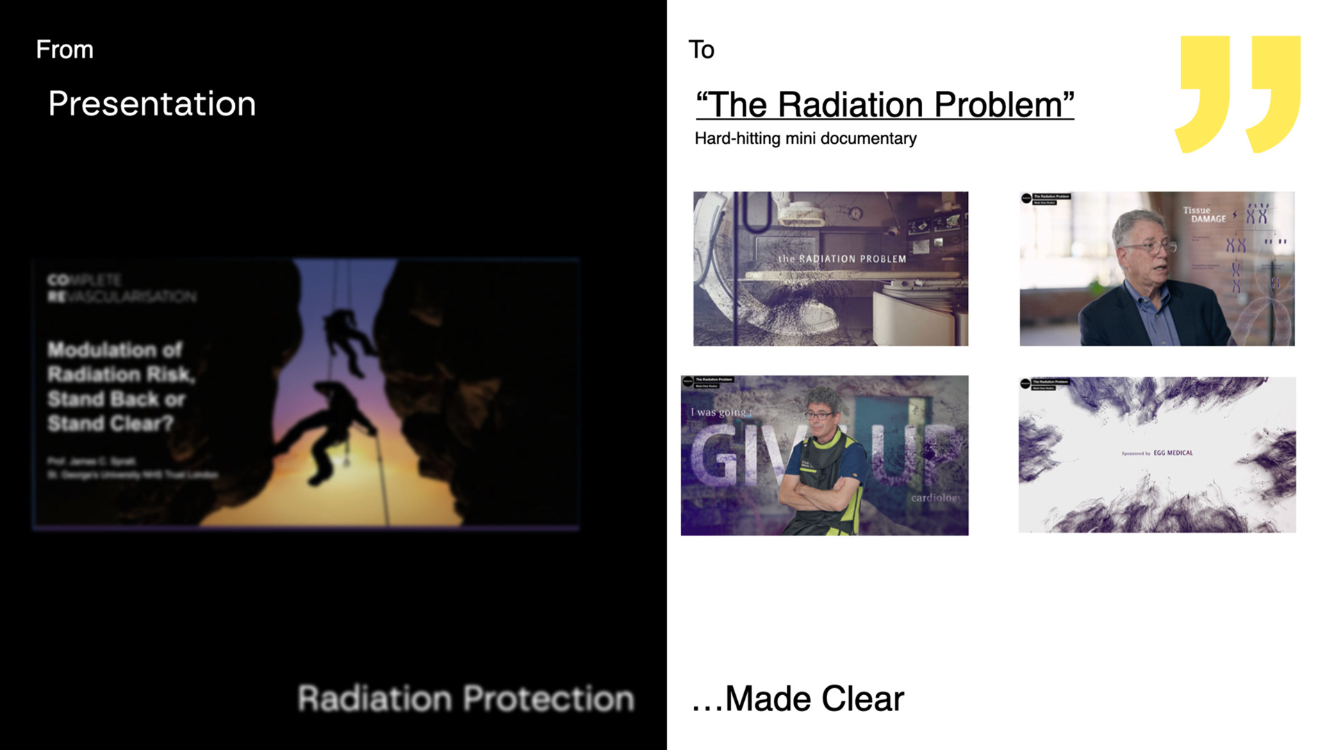
In discovery, we worked closely with founder and director Mike Clear to understand the company’s ethos and tone. Mike shared early references with us—drawing from Apple’s keynote design language and the minimalist "less is more" philosophy. The deck needed to feel sharp, high-concept, and deliberate. Call-to-action sections were emphasized early as crucial storytelling moments, not just functional inclusions.
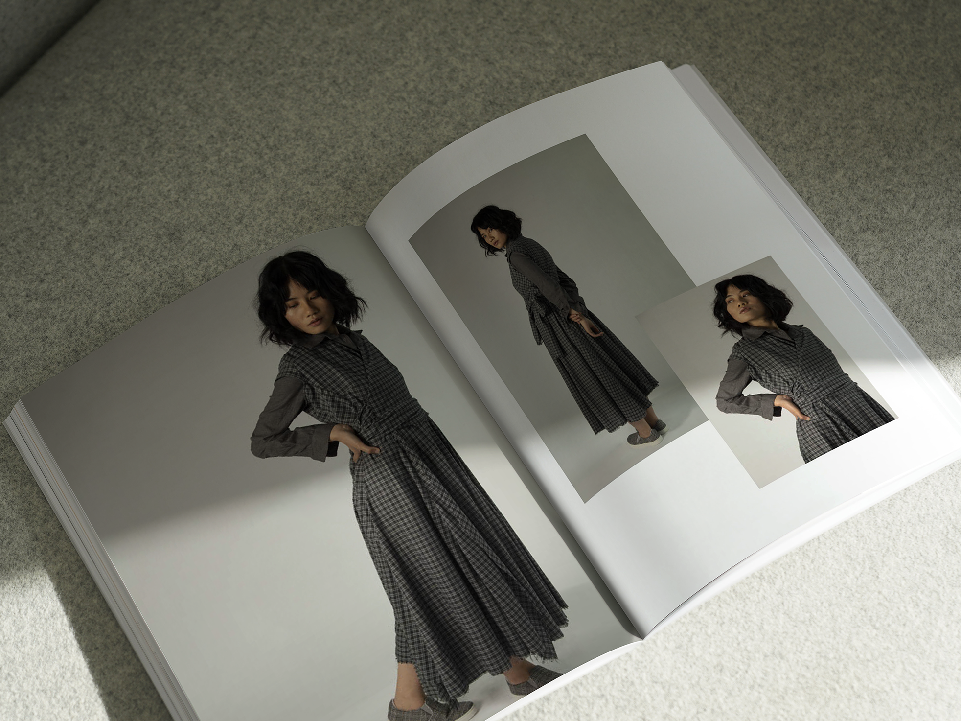
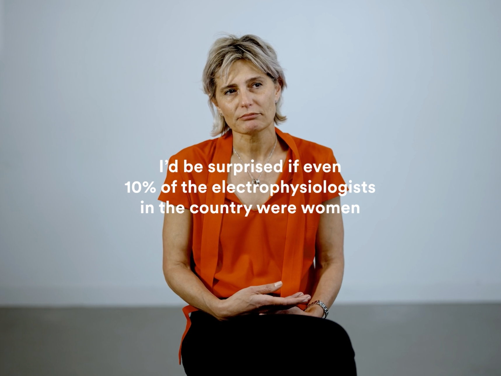
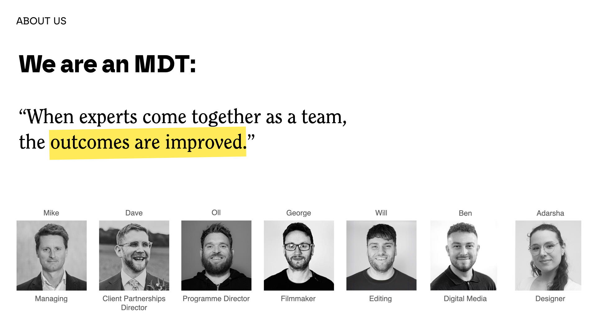
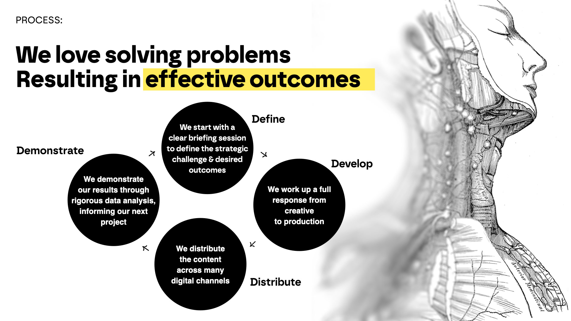
Having worked with Mike on previous projects, we had an established workflow—rapid feedback cycles, iterative concept development, and close collaboration. I built out storyboards and shared updates frequently, mirroring the process we used on the Because You’re a Woman documentary. Croma provided the base photography and logo system, while I took the lead on the visual identity and layout structure for the deck.
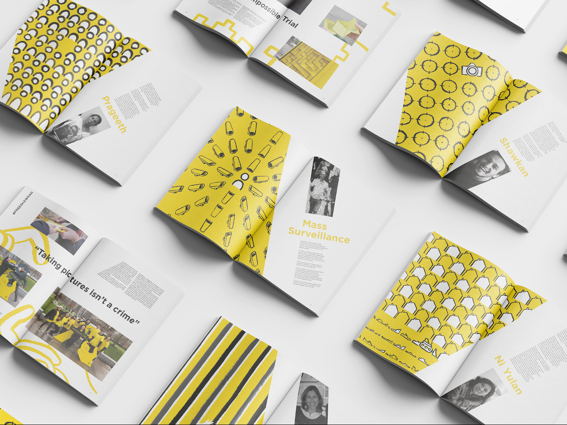
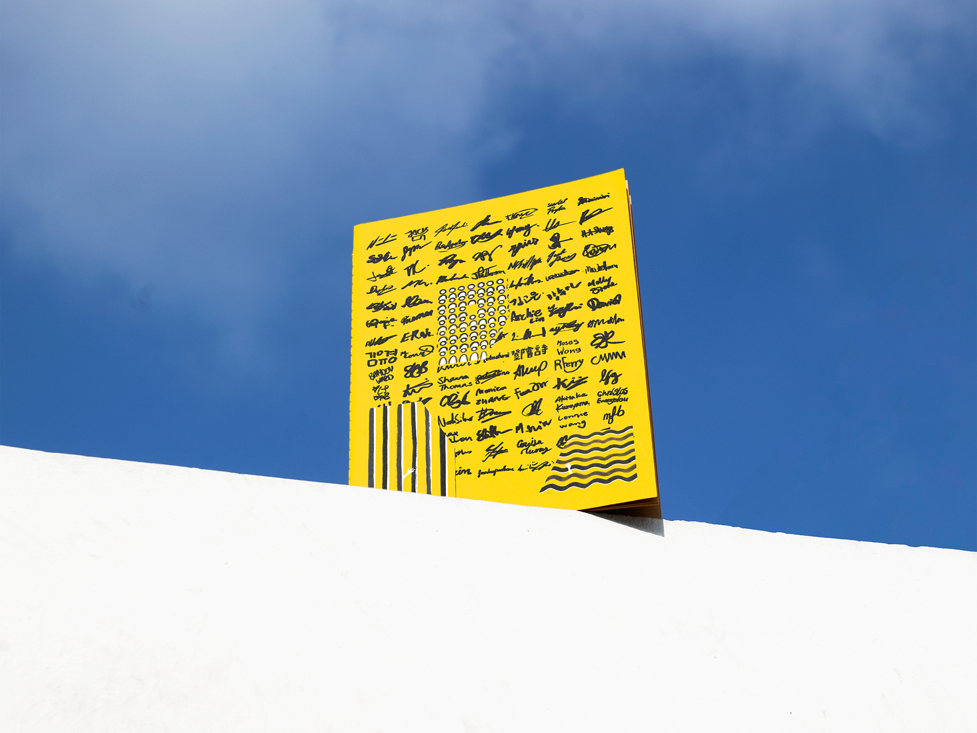
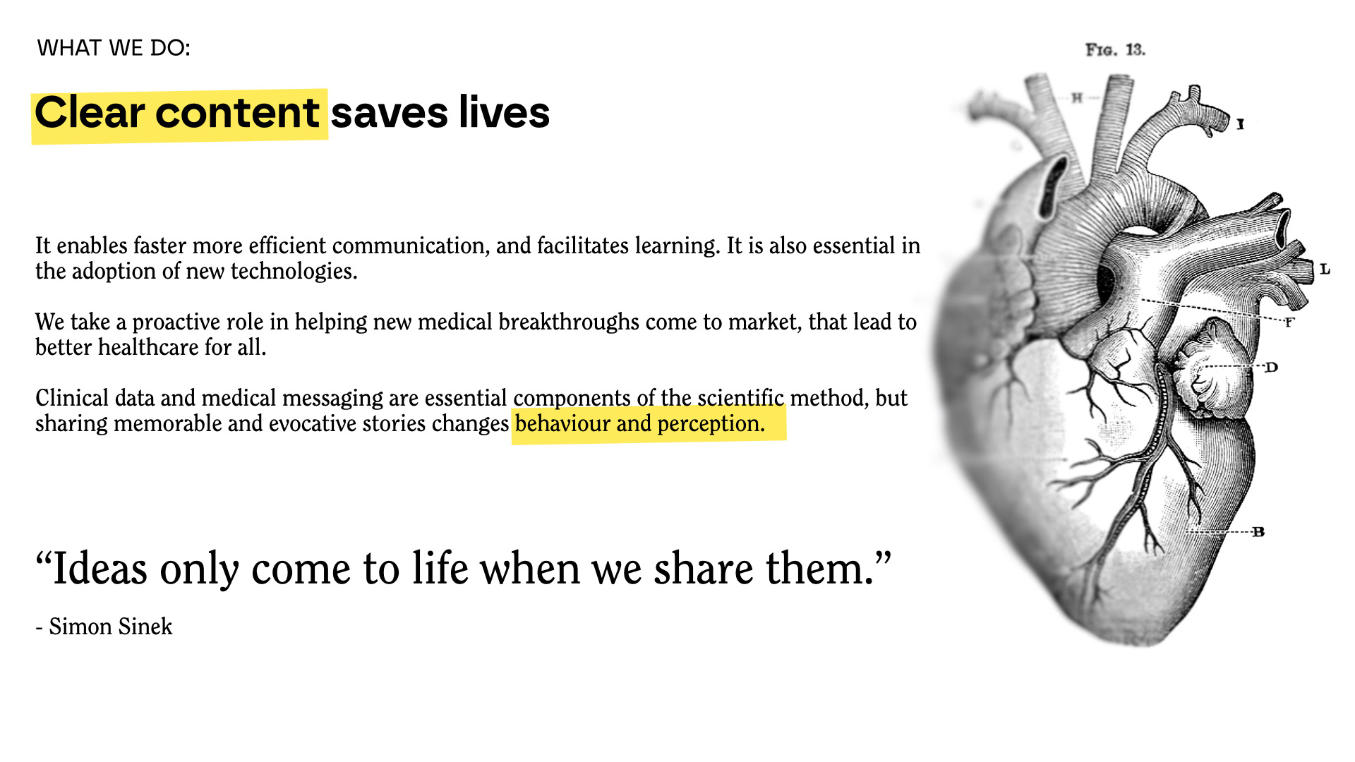
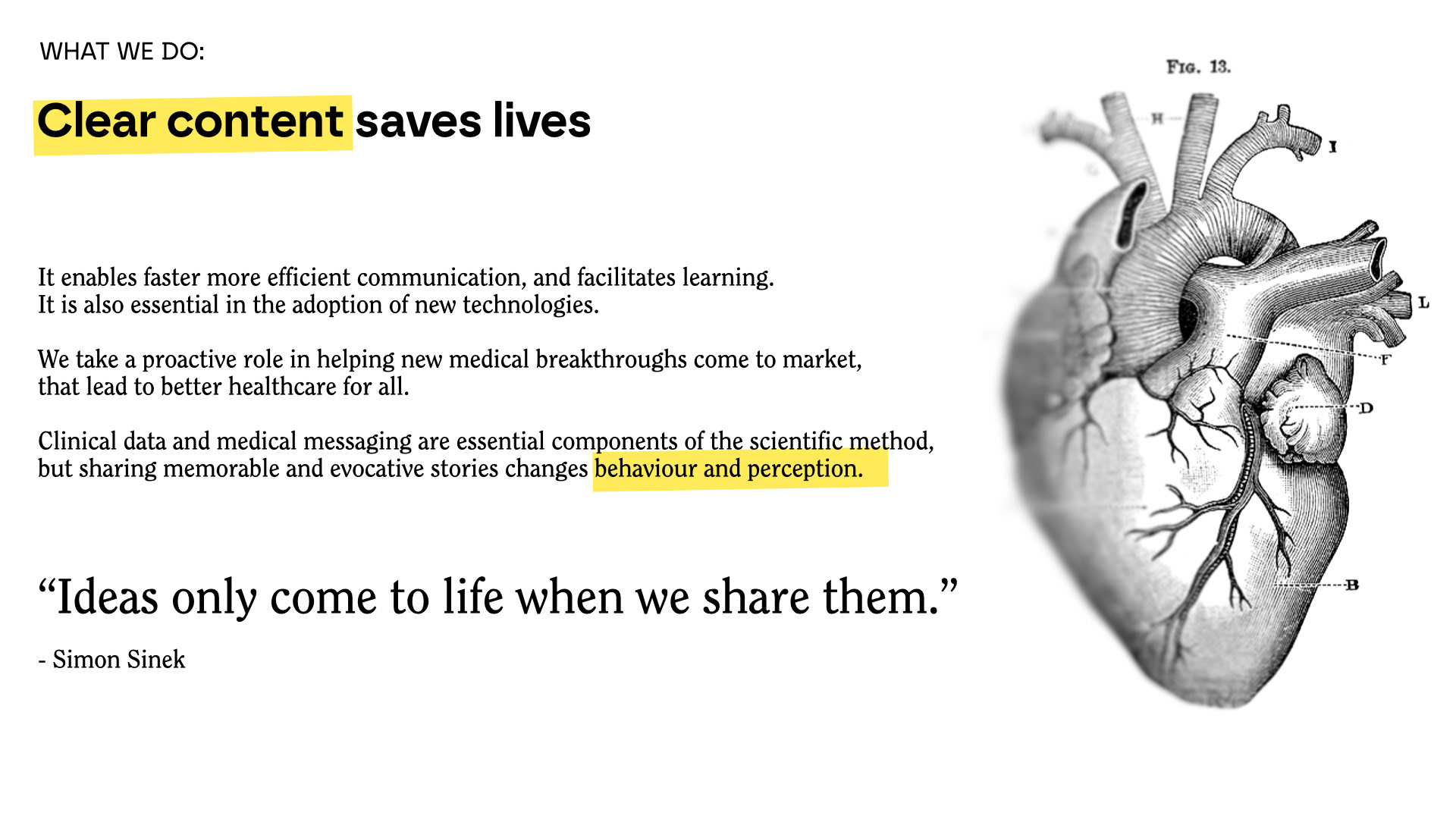
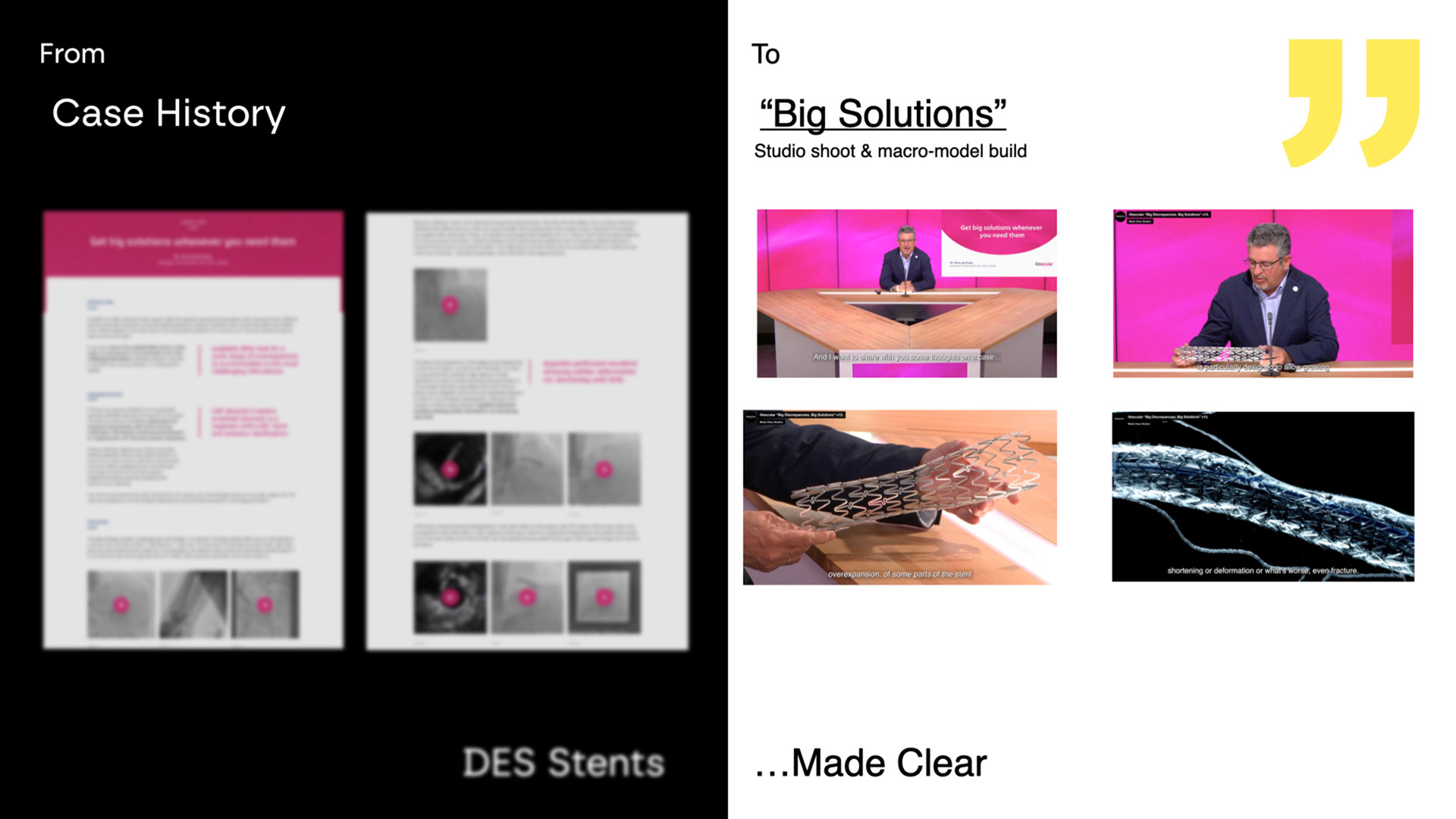
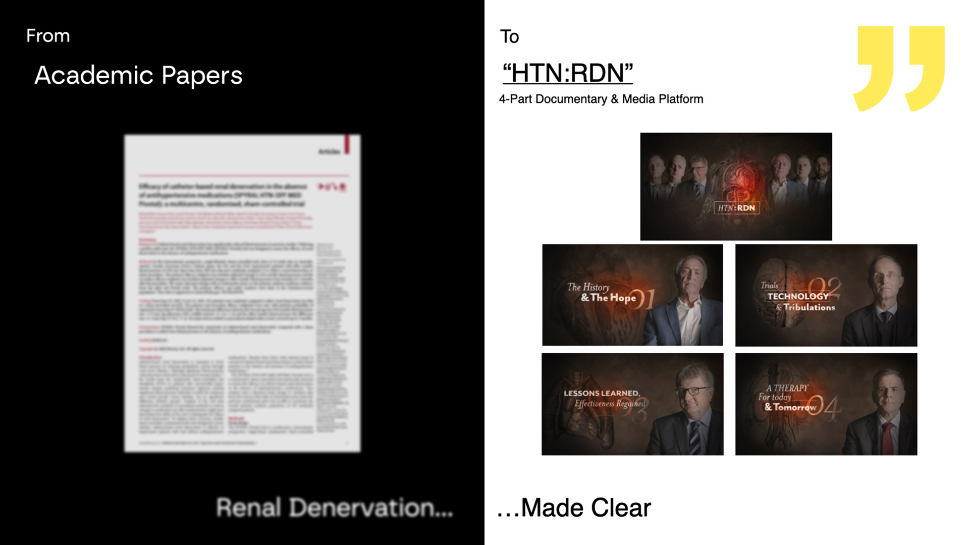
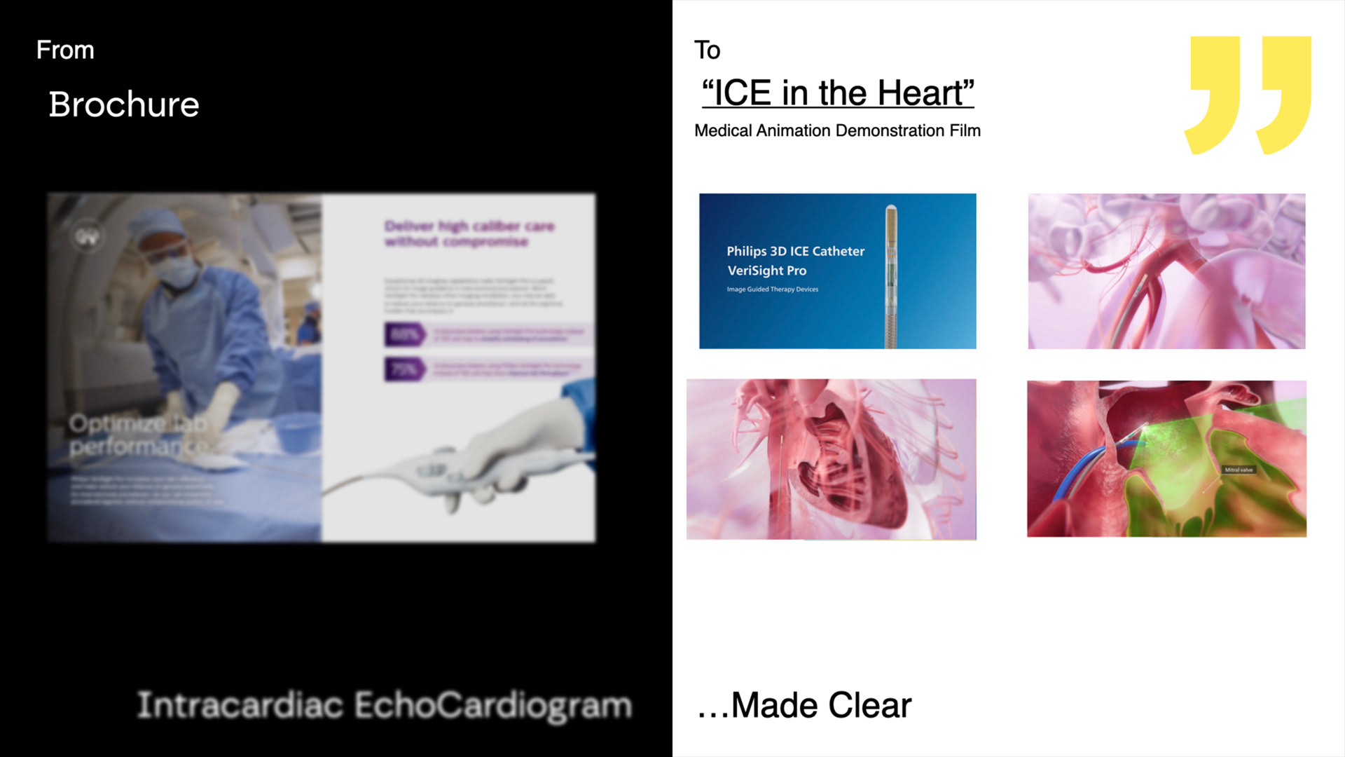
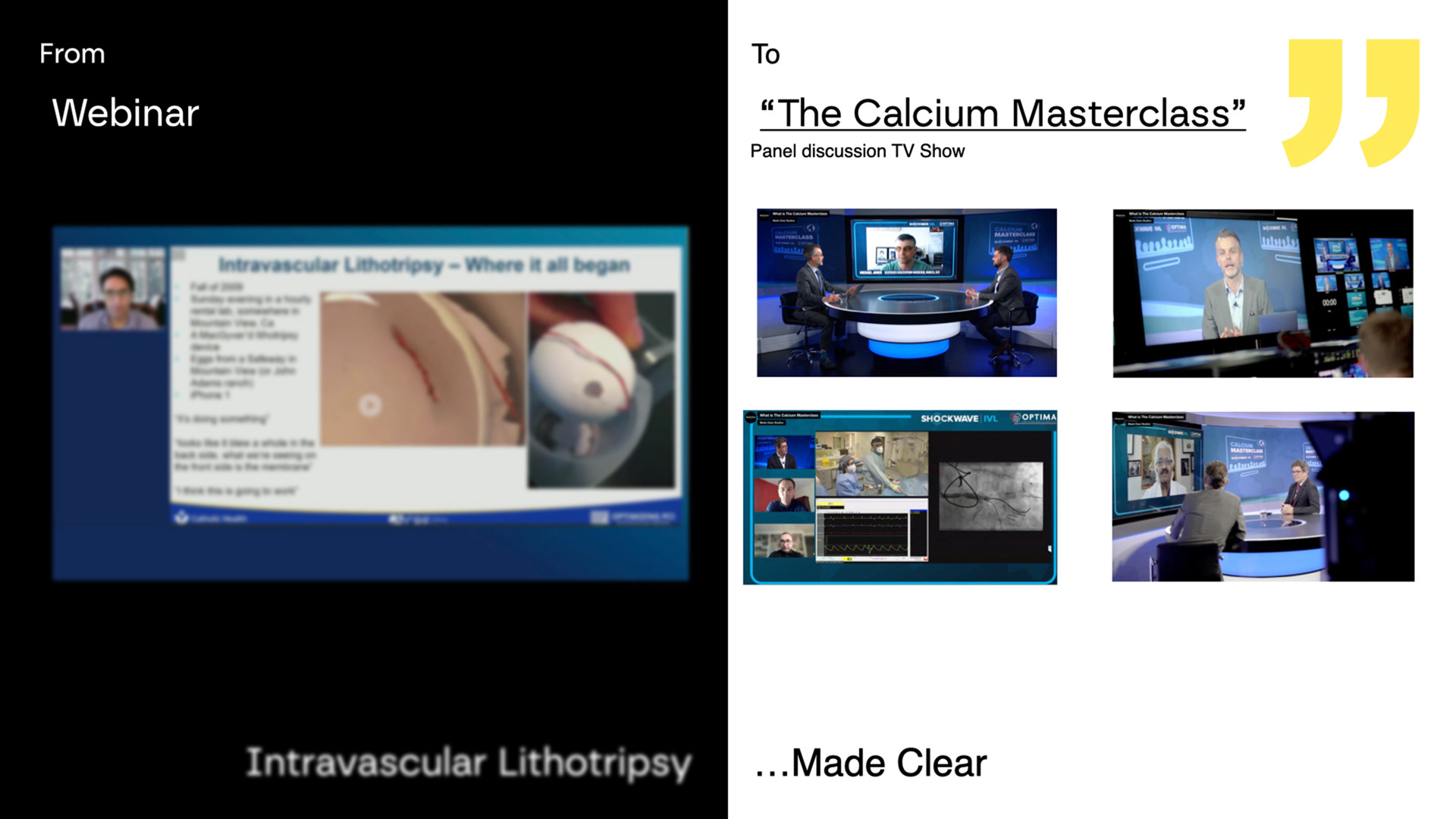
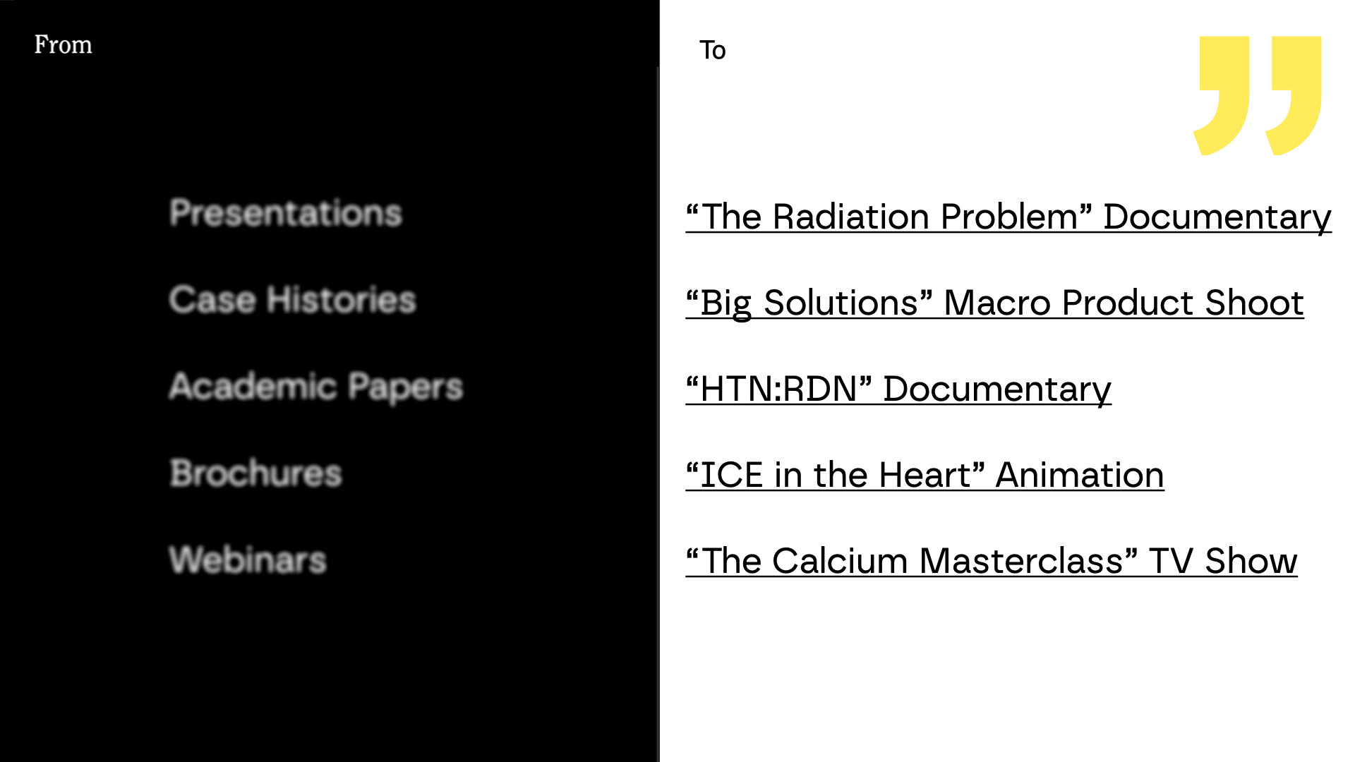
In development, imagery became a defining element. I sourced public domain assets through archival platforms like Public.Work—selecting anatomical illustrations (heart, brain, human body) that added symbolic weight and aligned with the brand’s messaging. These weren’t decorative choices—they gave the deck a visual rhythm and emotional depth. The team responded strongly to their presence and approved their inclusion quickly.
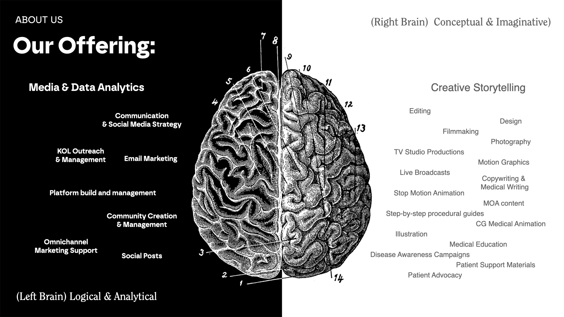
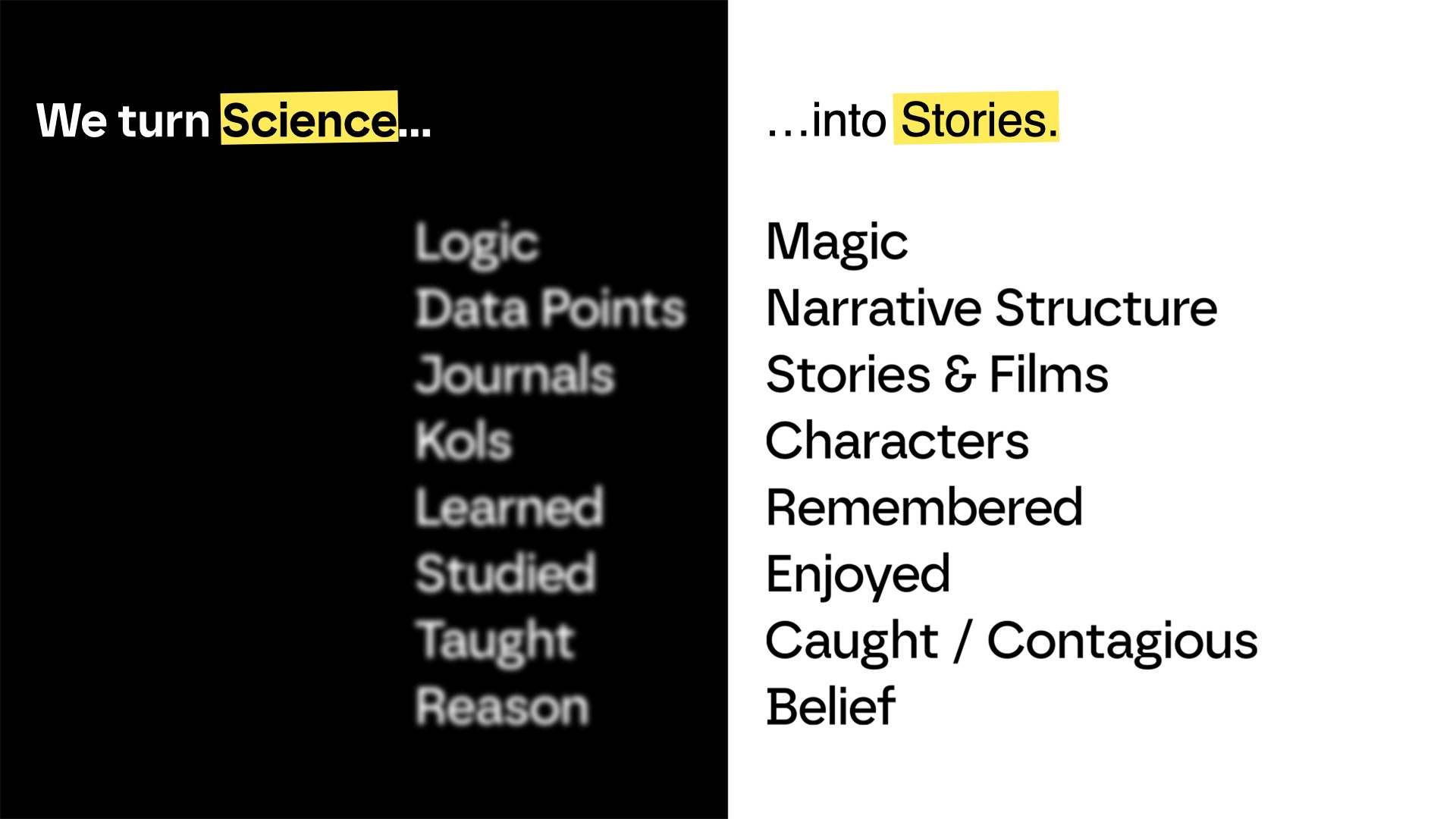
The color system followed the brand’s monochrome foundation, with yellow used intentionally to highlight calls to action and punctuate key moments. This contrast brought warmth and momentum to an otherwise raw and restrained palette, striking a balance between clarity and emotion. The tone leaned brutalist in form, but never cold—each detail considered and connected to the message.
The final deck ran across twenty-two slides. Every section was designed to guide the viewer, build toward engagement, and land with focus. We paid close attention to length, pacing, and visual breaks, making sure nothing distracted from the story being told.
Final approval came after a live session with Mike and Croma, where we locked in content, sequence, and styling. The deck served as a launchpad for Made Clear’s investor conversations—a statement of intent, built with the same care they bring to their filmmaking.

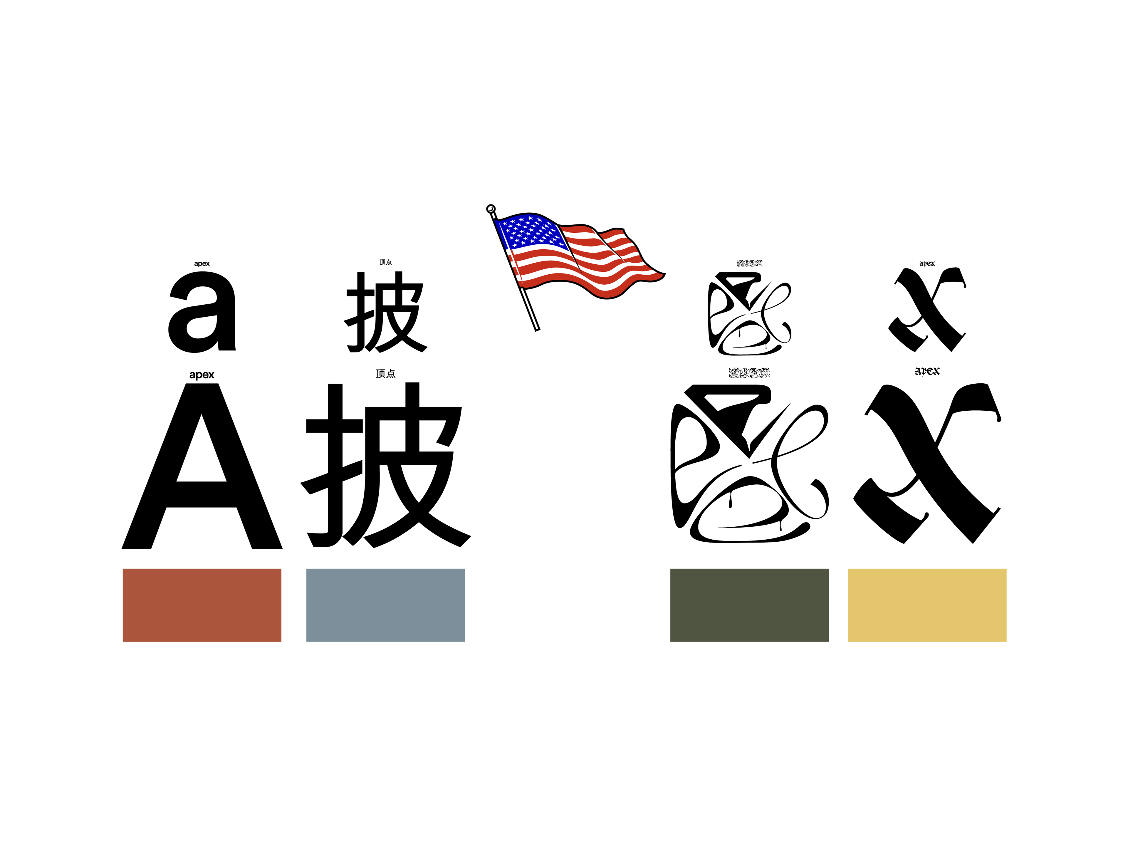
Design Influences: Apple keynote presentations, minimalist editorial systems, brutalist typography, archival medical illustration, and the visual clarity of early scientific publishing.
Deliverables: Complete 22-slide investor deck including layout, typography, image curation, call-to-action structure, and collaborative design oversight with Croma Studio and the Made Clear team.