Project Description:
Apex FC approached Studio PME with a bold brief: to create a football club identity rooted in the energy, culture, and atmosphere of Las Vegas. Still in its early stages, the club needed a visual identity that felt new, ambitious, and distinctly tied to the city it calls home.
In discovery, we explored what Apex stood for—alertness, unpredictability, and raw ambition. The founders had a clear audience in mind: teenagers and early twenty-somethings with a love for football, music, nightlife, and style. The brand had to feel fast, loud, and alive.
Our conversations moved from football culture to city culture. The team wanted the identity to echo the high-stakes, high-glamour spirit of Vegas nightlife. We studied archival images of old Las Vegas alongside the city’s evolving political and creative scene. That blend—past and present, grit and glow—shaped the direction of the design.
Aesthetically, the club referenced global heavyweights like Arsenal, PSG, and Barcelona—not for their playstyle, but for how they’ve positioned themselves in fashion and pop culture. Travis Scott also came up as a key influence, particularly his branding and past work in Vegas. These references set a tone: the club had to feel culturally fluent, not traditional.
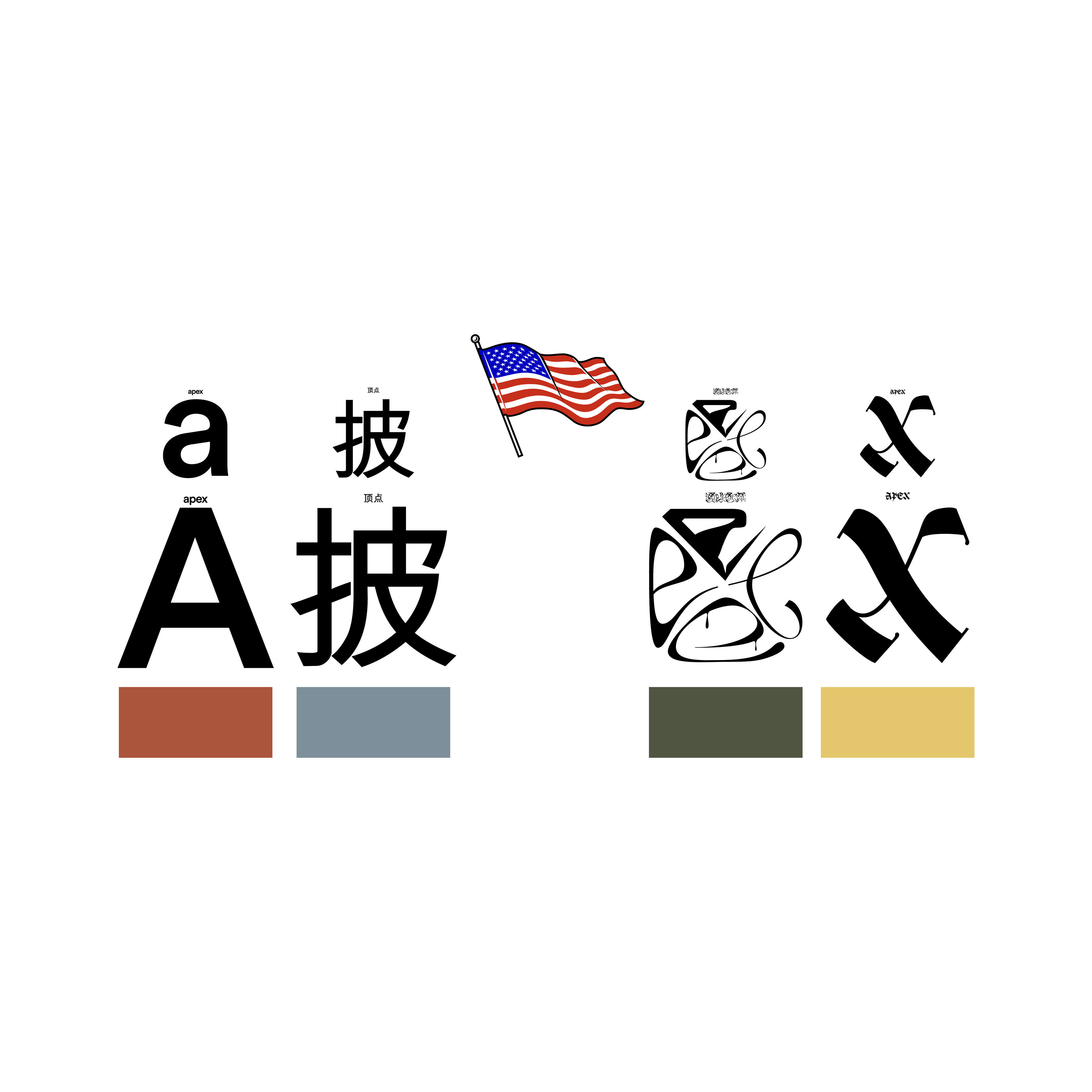
The final emblem was built through experimentation—a typographic hybrid that drew from multiple cultures and visual languages. The typefaces were carefully chosen to represent the diverse communities that shape Apex FC, from Asian American to African American influences. The result felt global but grounded, modern but meaningful.
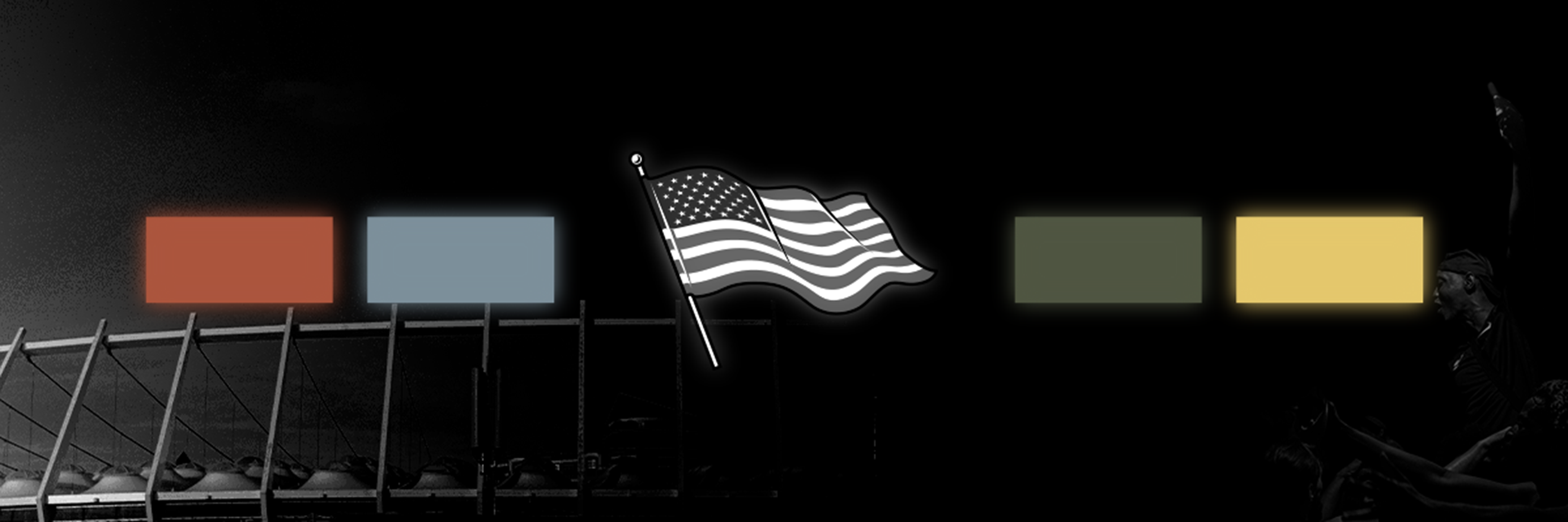
Color was used with intent. Red for passion. Blue for caution and control. Green for growth. Yellow for joy. Each color tied into the emotional arc of football, and more importantly, the emotional arc of youth.
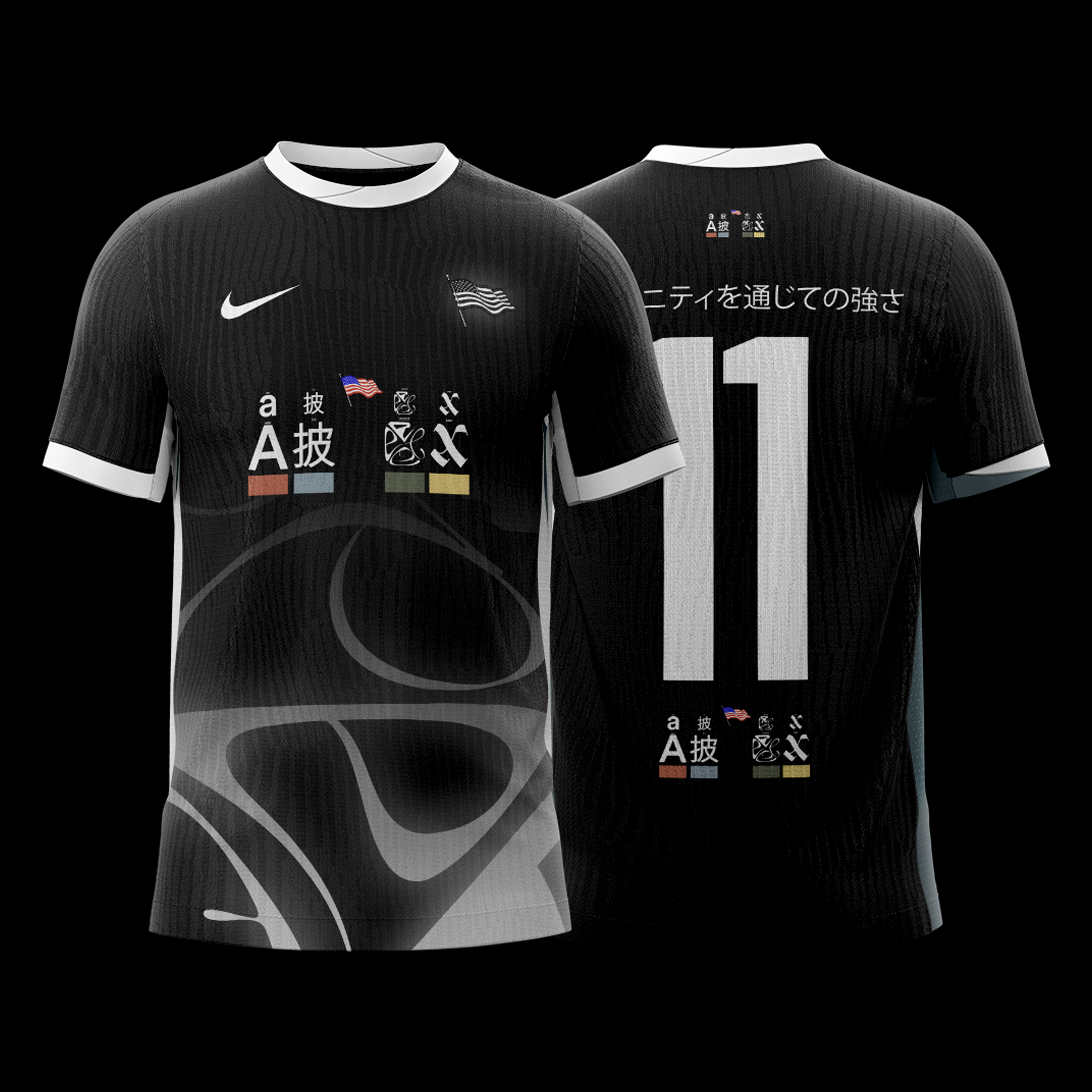
A key moment in the process was the introduction of the phrase “Do you pass the eye test?” A common phrase in football, it became Apex FC’s unofficial motto. We studied vision charts and optical diagrams, using them as a foundation for the emblem’s structure—subtly embedding that idea of scrutiny, clarity, and confidence.
Japanese typography also played a role. We experimented with its use across the kit, drawing from Asian football design and considering it as an alternative to the standard English naming system. Numbers remained in English for clarity and tradition, but the visual blend added depth.
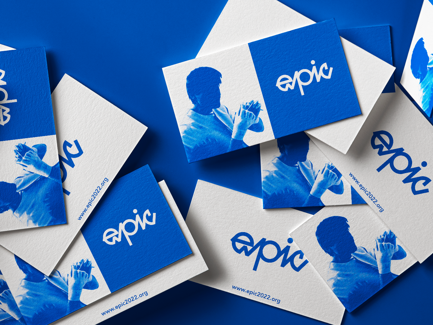
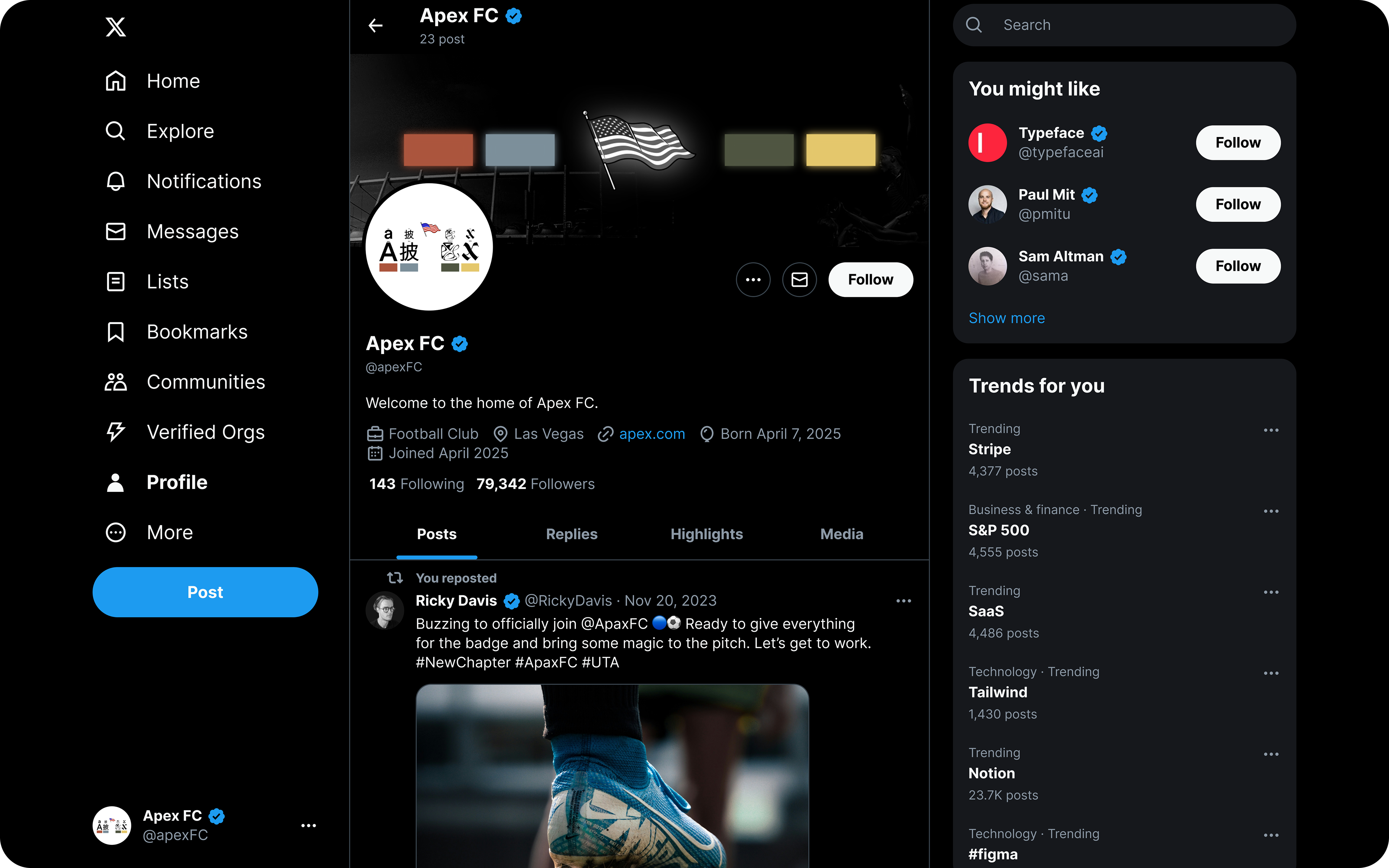
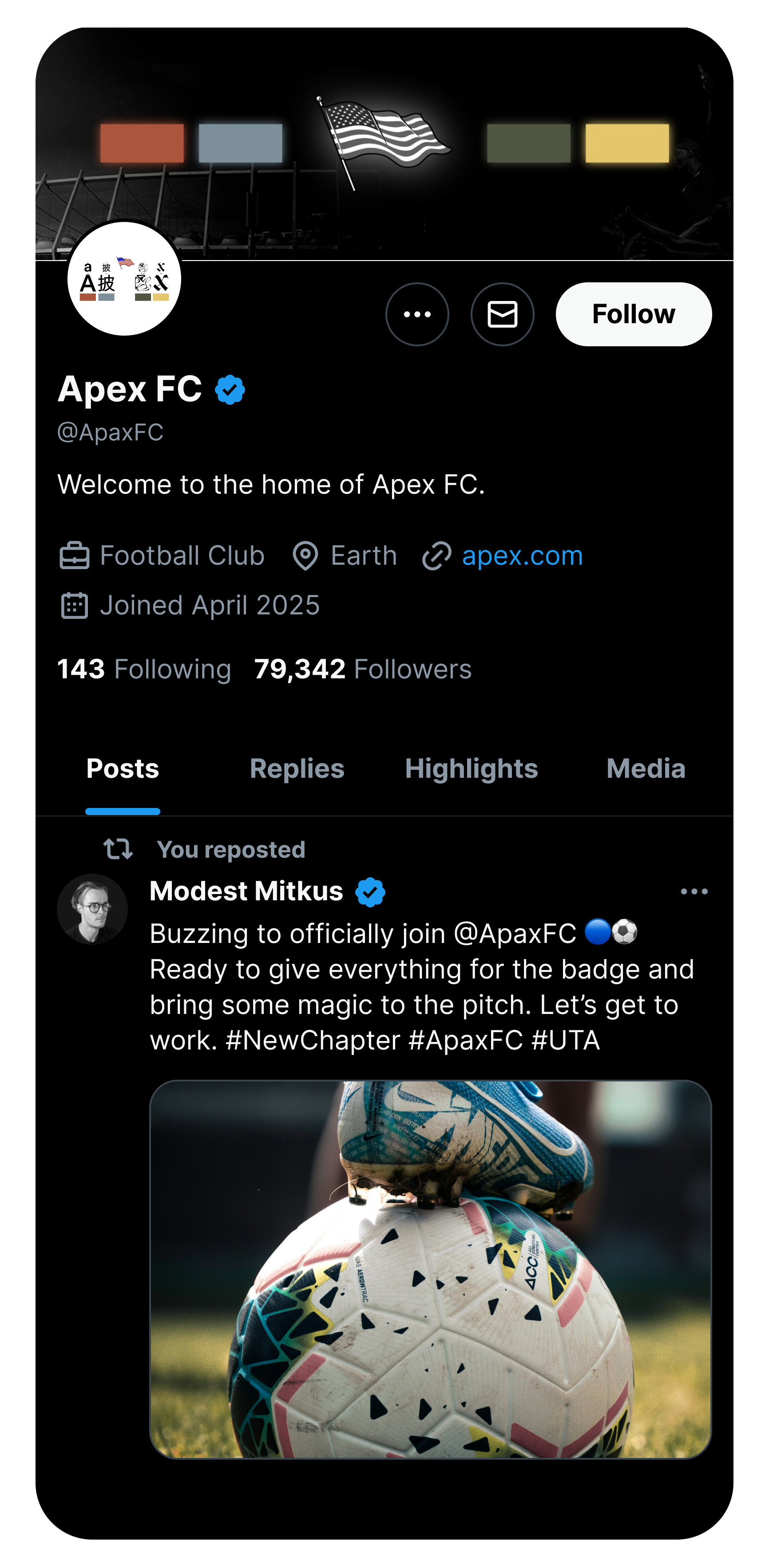
When it came to the jersey, the emblem took center stage. This was a deliberate choice. As a new club, Apex needed a first impression that felt definitive. The crest wasn’t treated as a secondary detail—it became the focal point, repeated and emphasized to lock it into memory. For a team still writing its story, this emblem became the first chapter.
Design Influences: Old and modern Las Vegas culture, the fashion-led branding of PSG, Arsenal, and Barcelona, Travis Scott’s visual universe, Japanese typography, streetwear, and football subcultures.
Deliverables: Full brand identity including club emblem, kit design, typography and color systems, social media templates, and cultural positioning strategy.