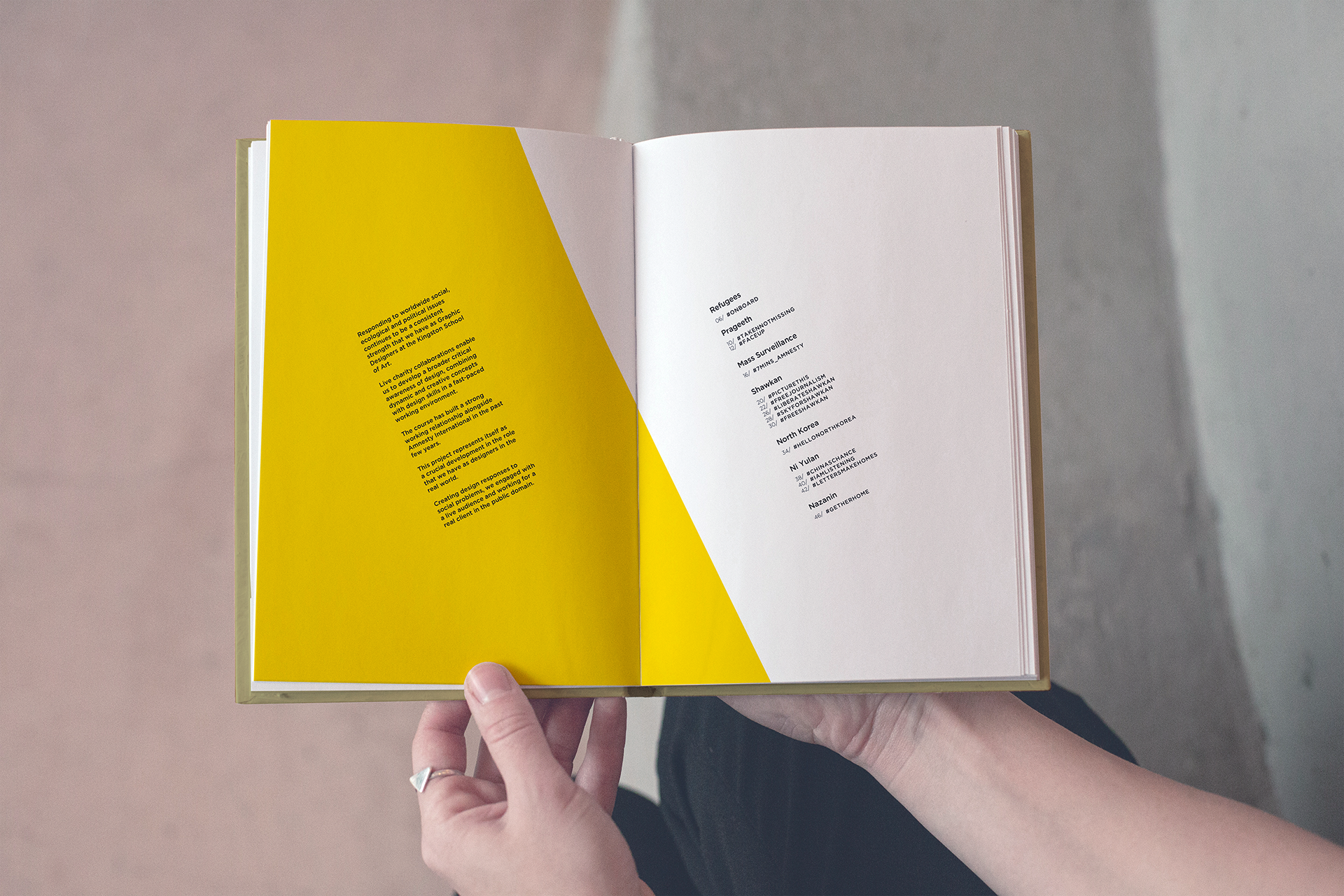
Project Description:
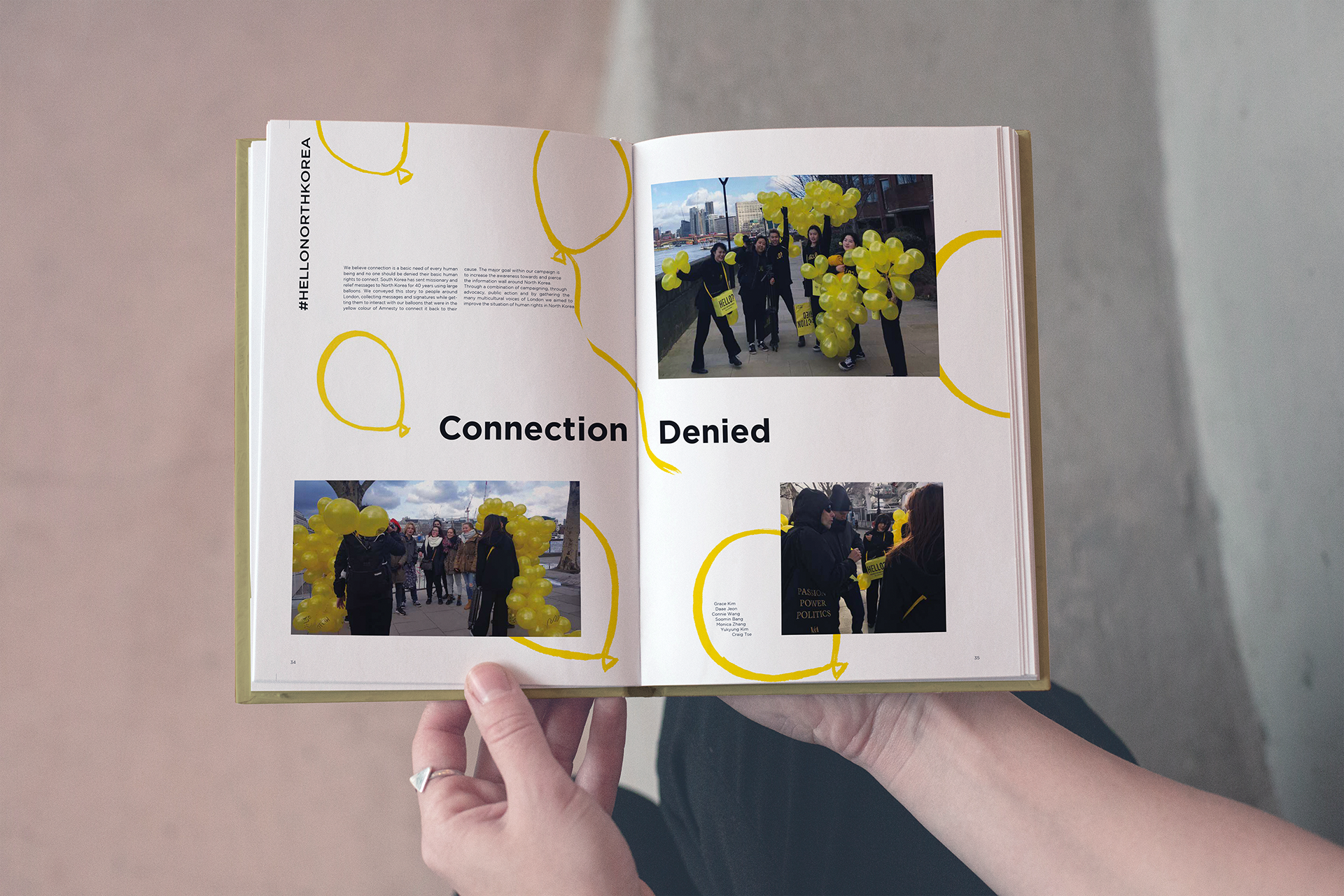
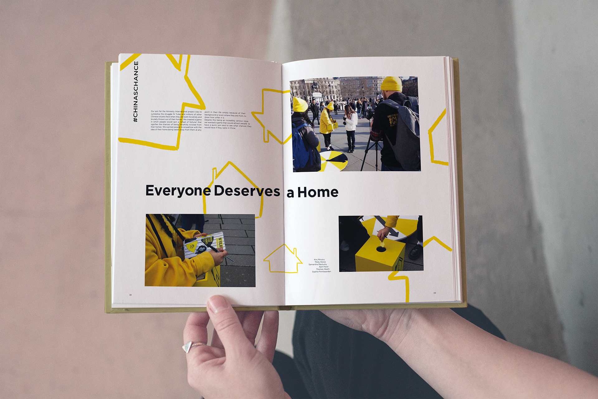
As part of a collaborative initiative with Amnesty International, Alfie Rushen (Studio PME) joined forces with designers Jack Li and Nicolai Engberg Røscher to lead the design of Signs of Hope—a publication featuring student-driven interactive responses to global social, ecological, and political issues.
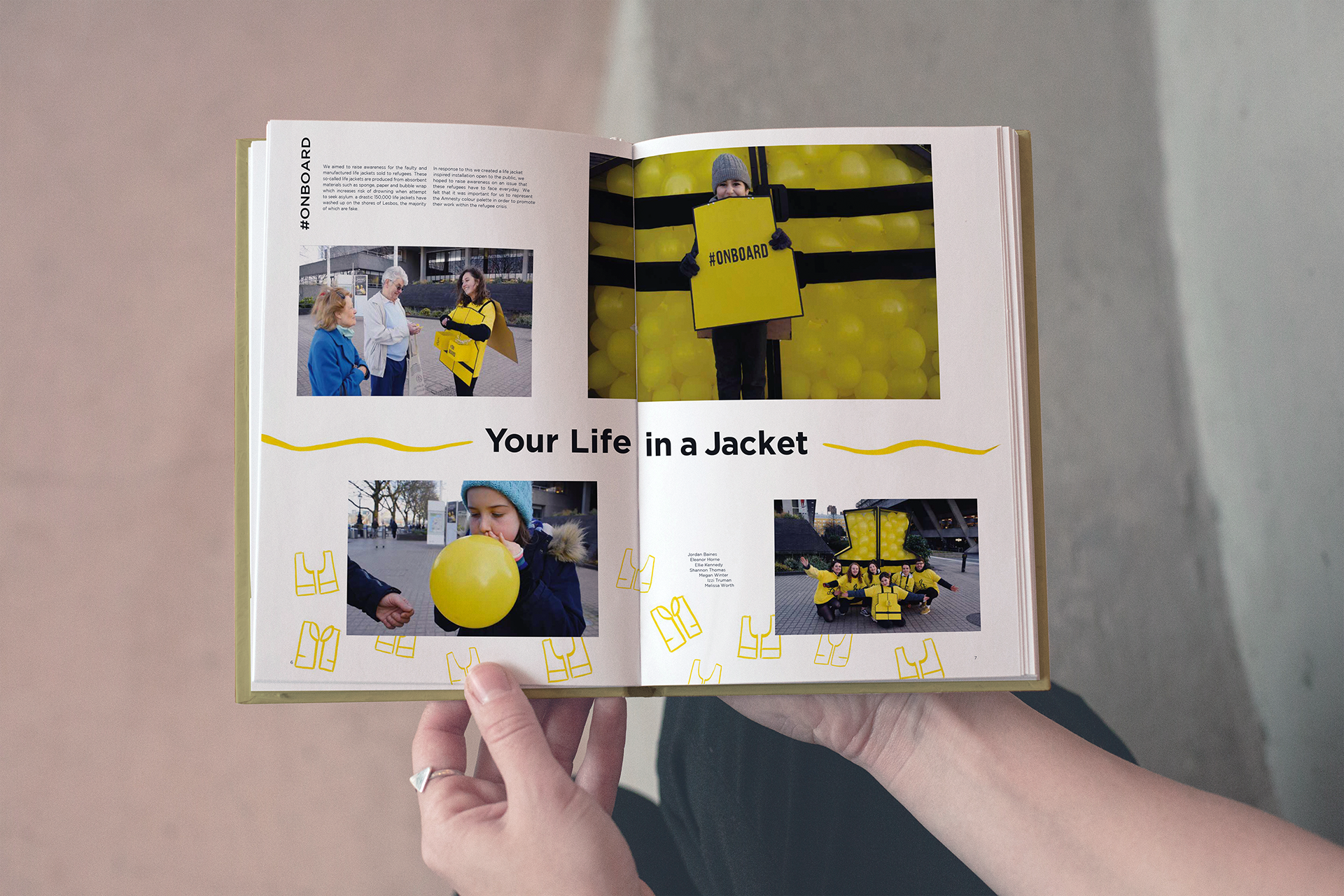
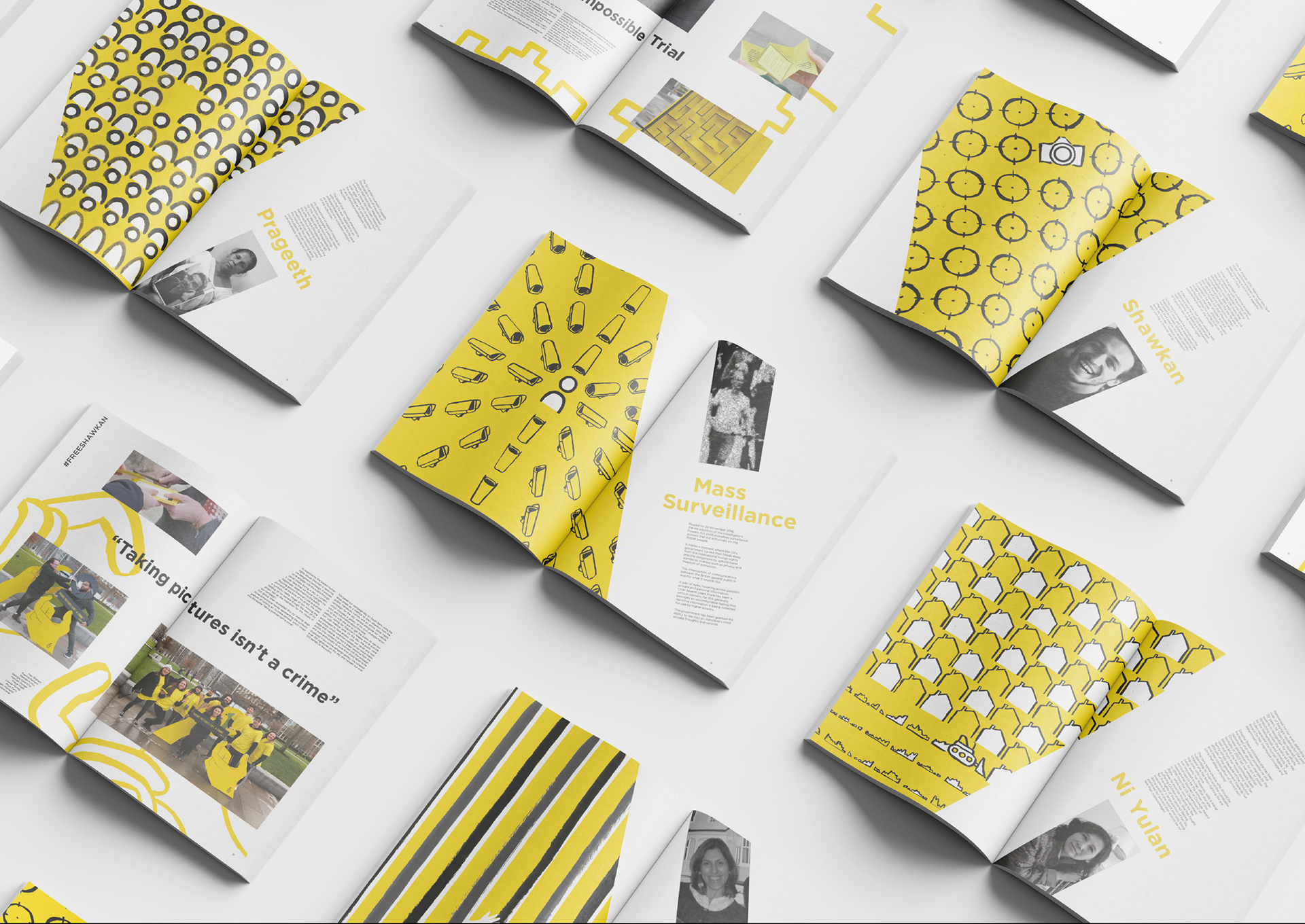
Created in partnership with Kingston School of Art, the project gave design students the opportunity to produce work for a real-world audience, addressing complex challenges through public-facing, three-dimensional installations. Our role was to translate that energy into a cohesive printed piece—one that honored both the students’ work and Amnesty’s core values.
In the discovery phase, we reviewed the full body of live projects produced during the school’s interactive 3D brief. We analyzed how each concept presented its issue, the emotional tone behind the work, and the color palettes used to communicate urgency, empathy, or resistance. From there, we broke down our roles: Alfie led layout and typography, Jack oversaw creative direction, and Nicolai focused on illustration and graphic nuance.
The challenge was emotional tone. How do you visually support a body of work that ranges from personal protest to systemic critique, without flattening its impact? We explored several layout systems, tested image-illustration relationships, and evaluated how to best reflect the messaging of Amnesty International as both client and collaborator.
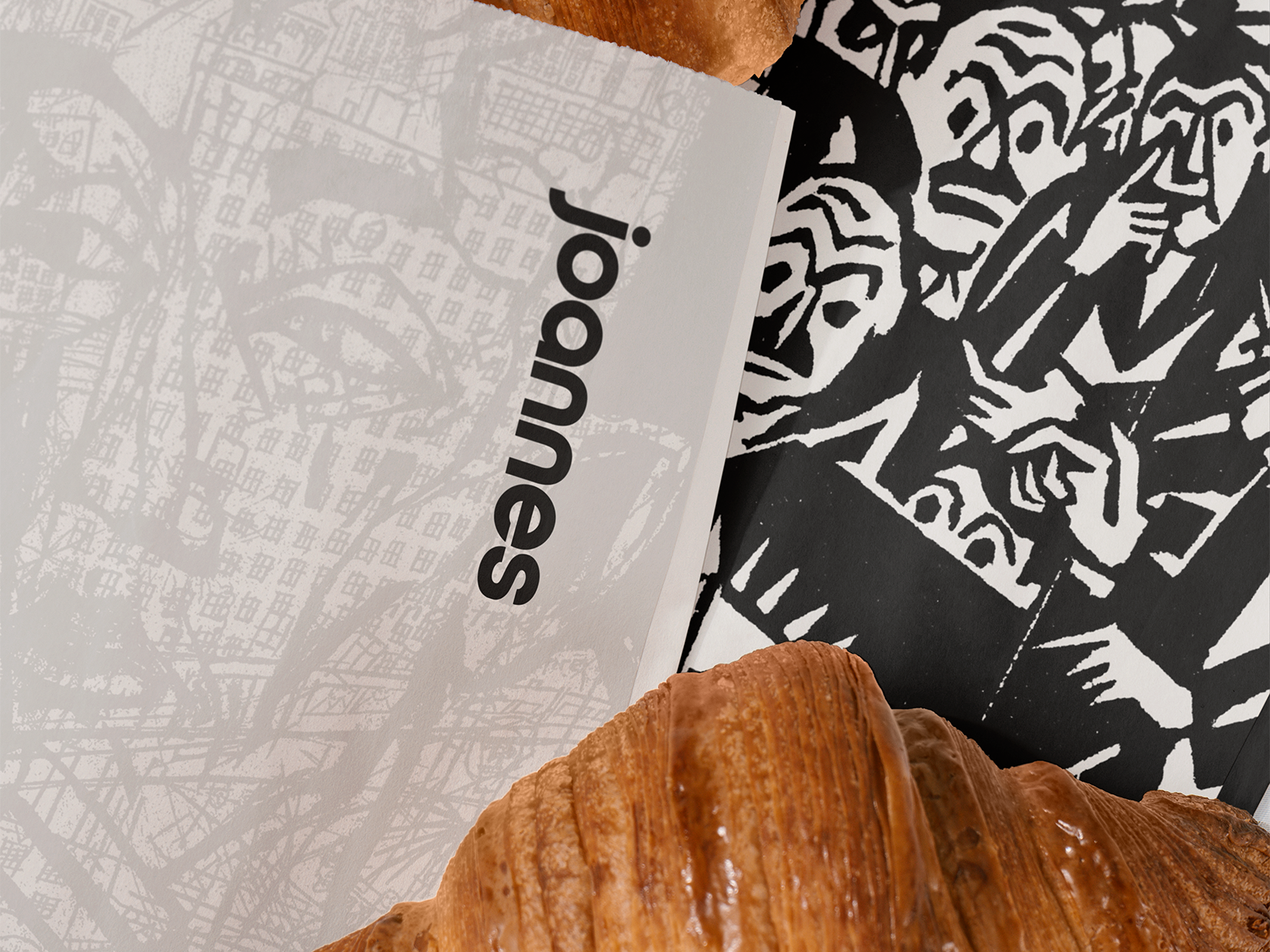
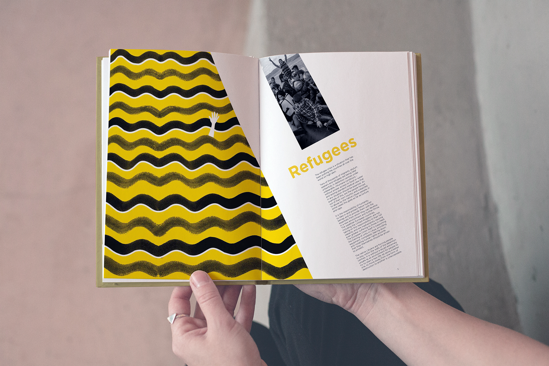
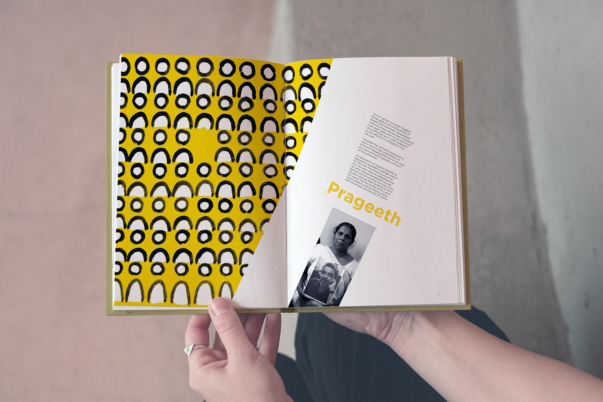
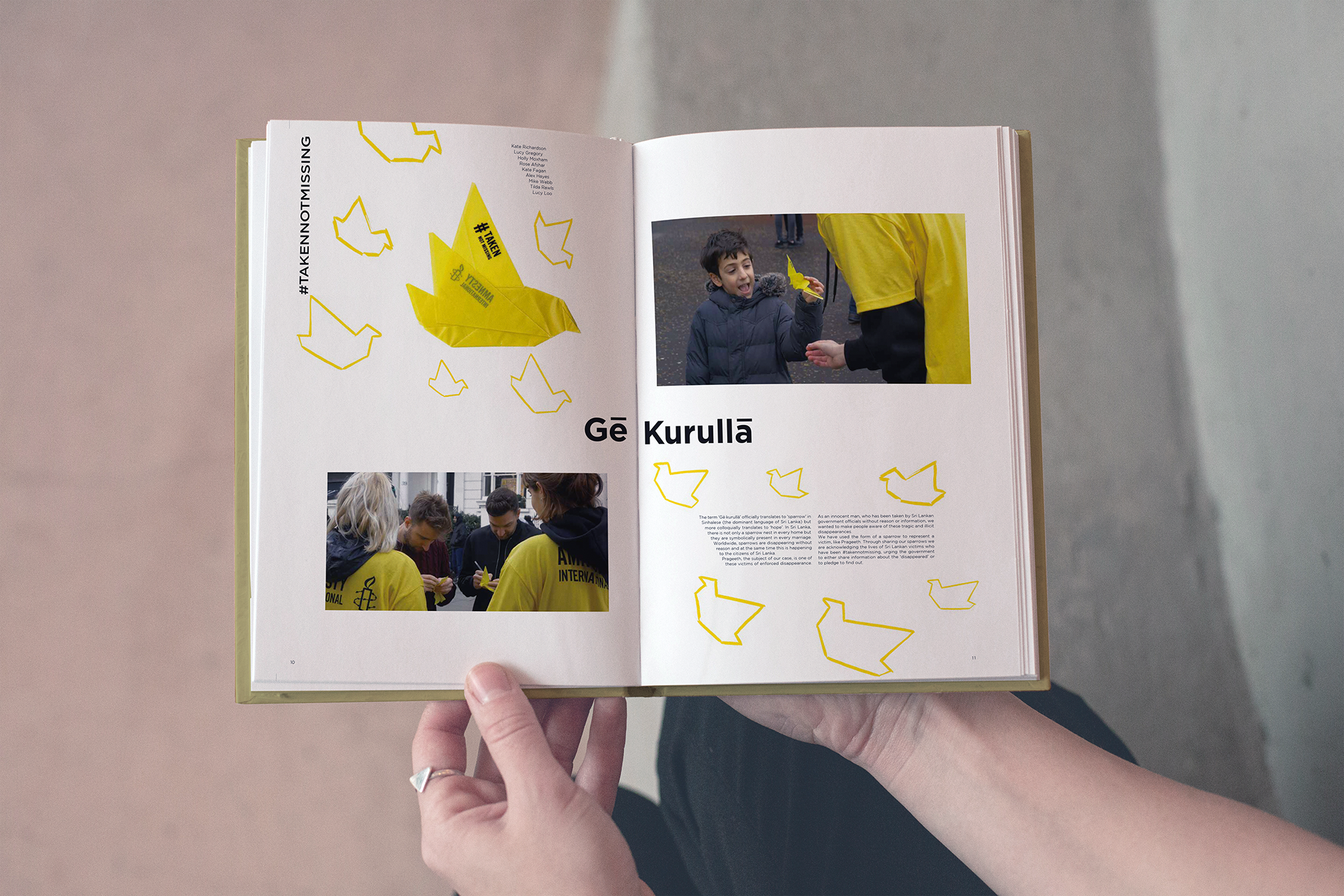
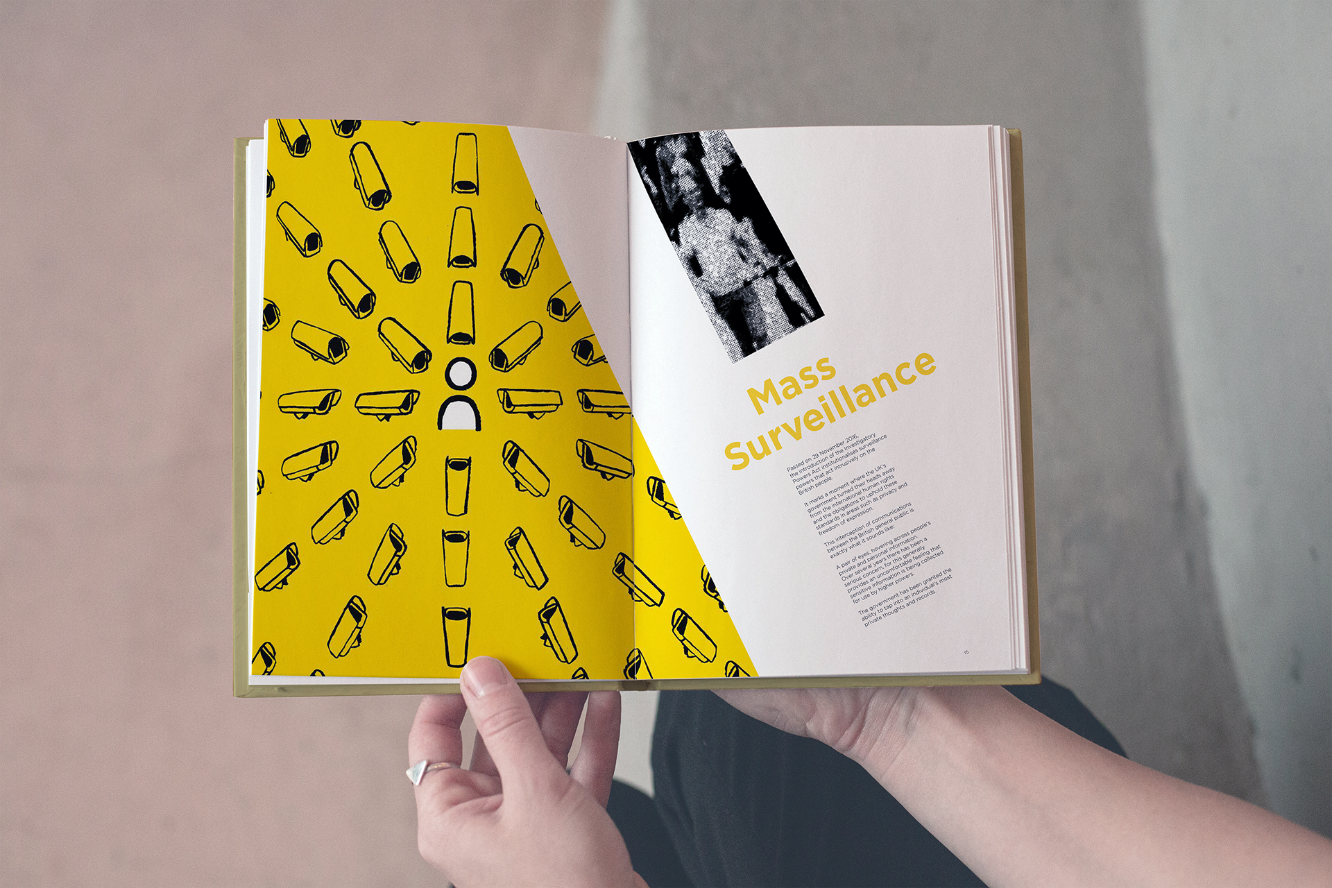
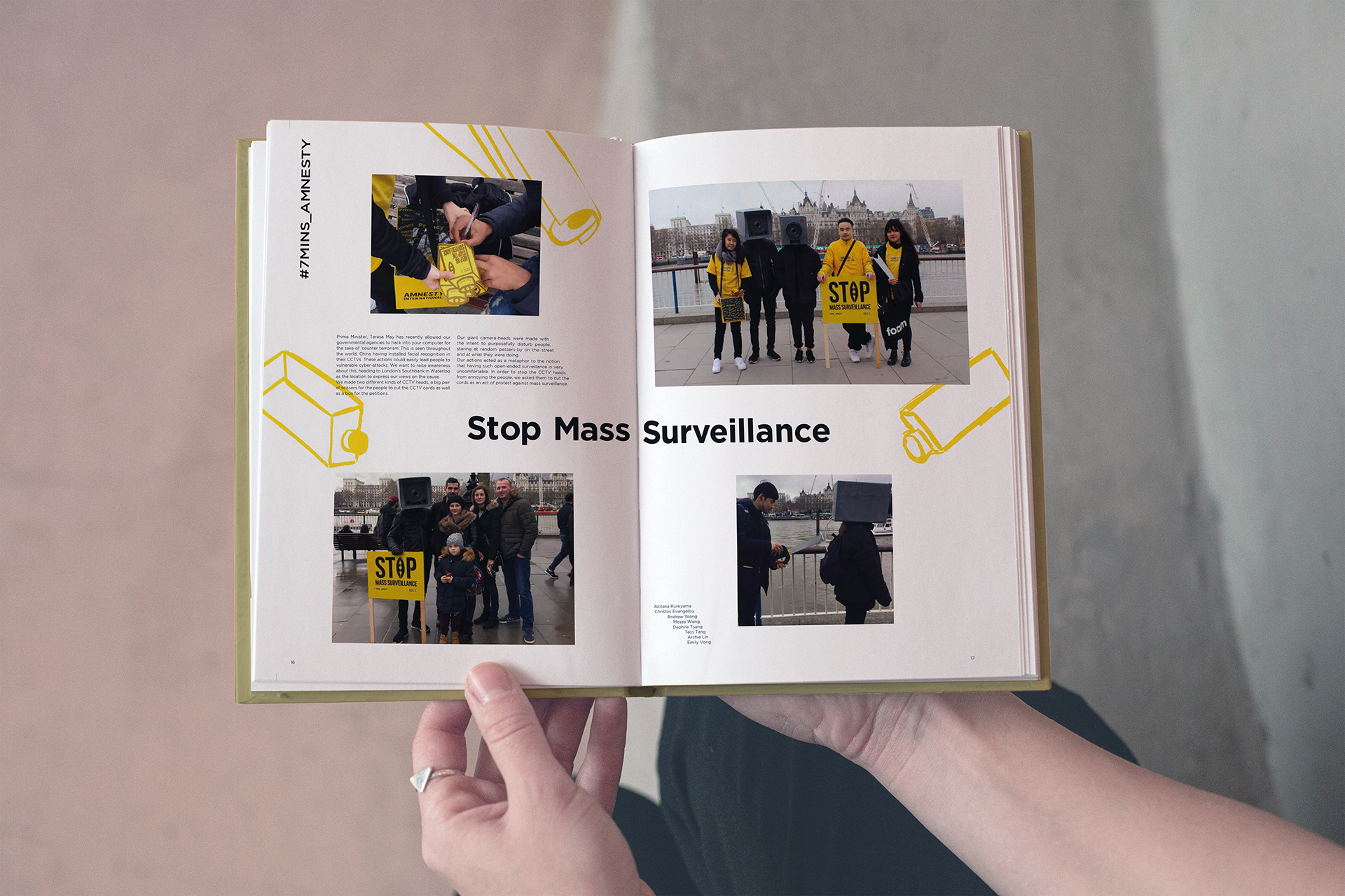
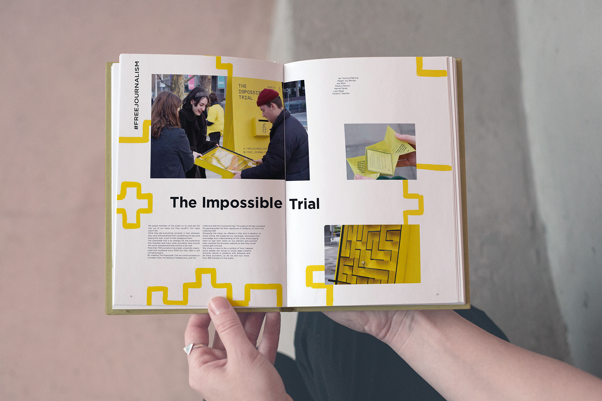
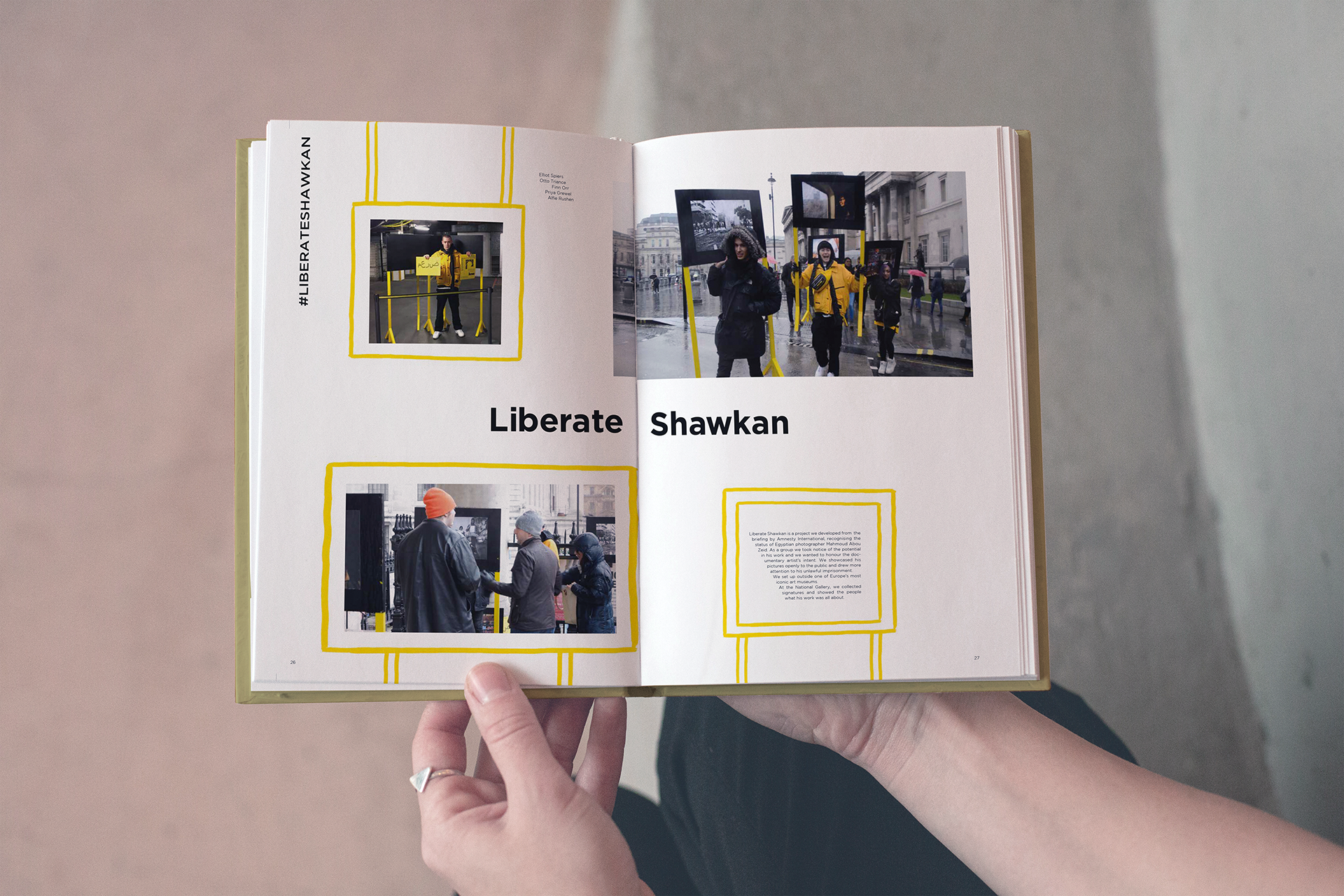
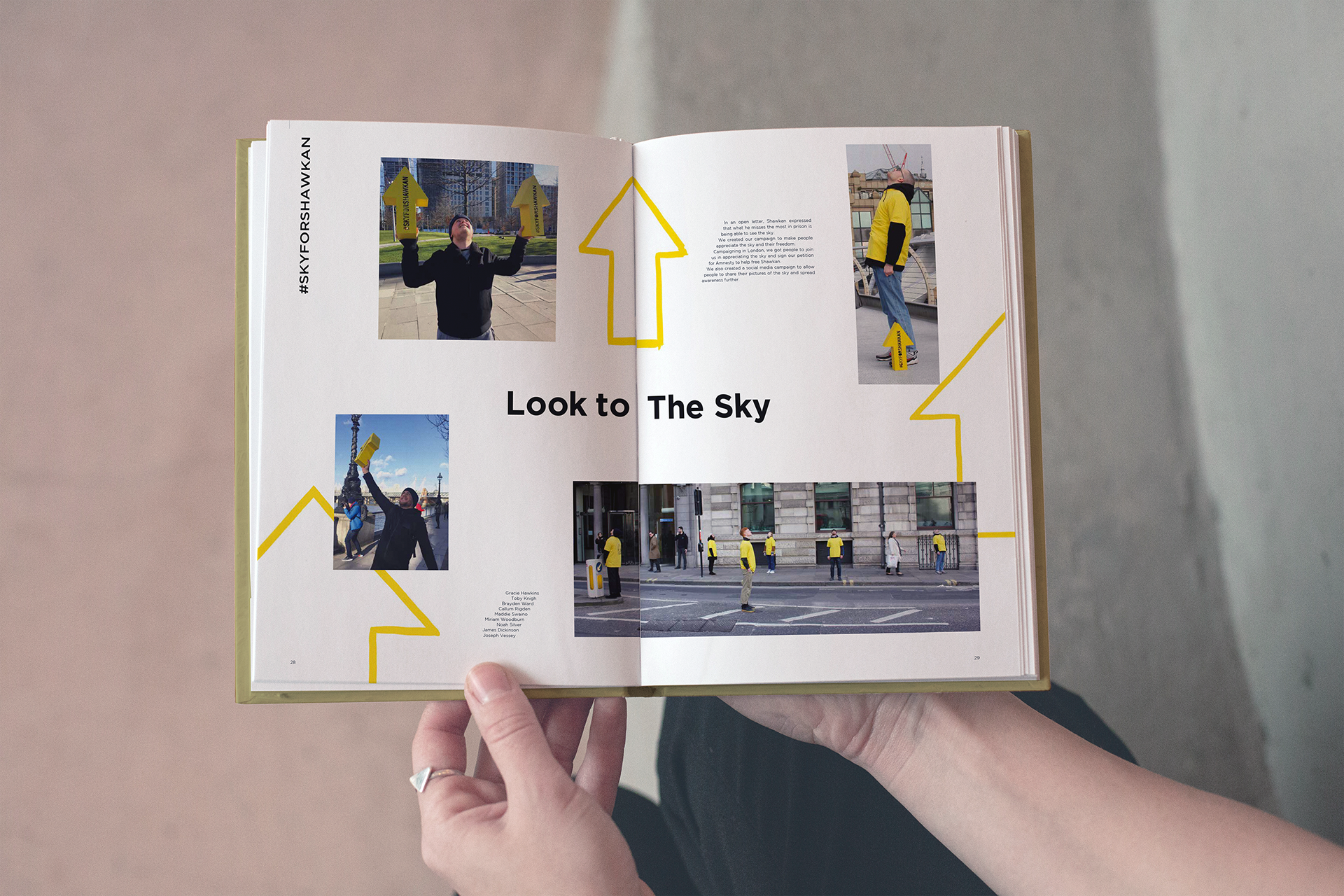
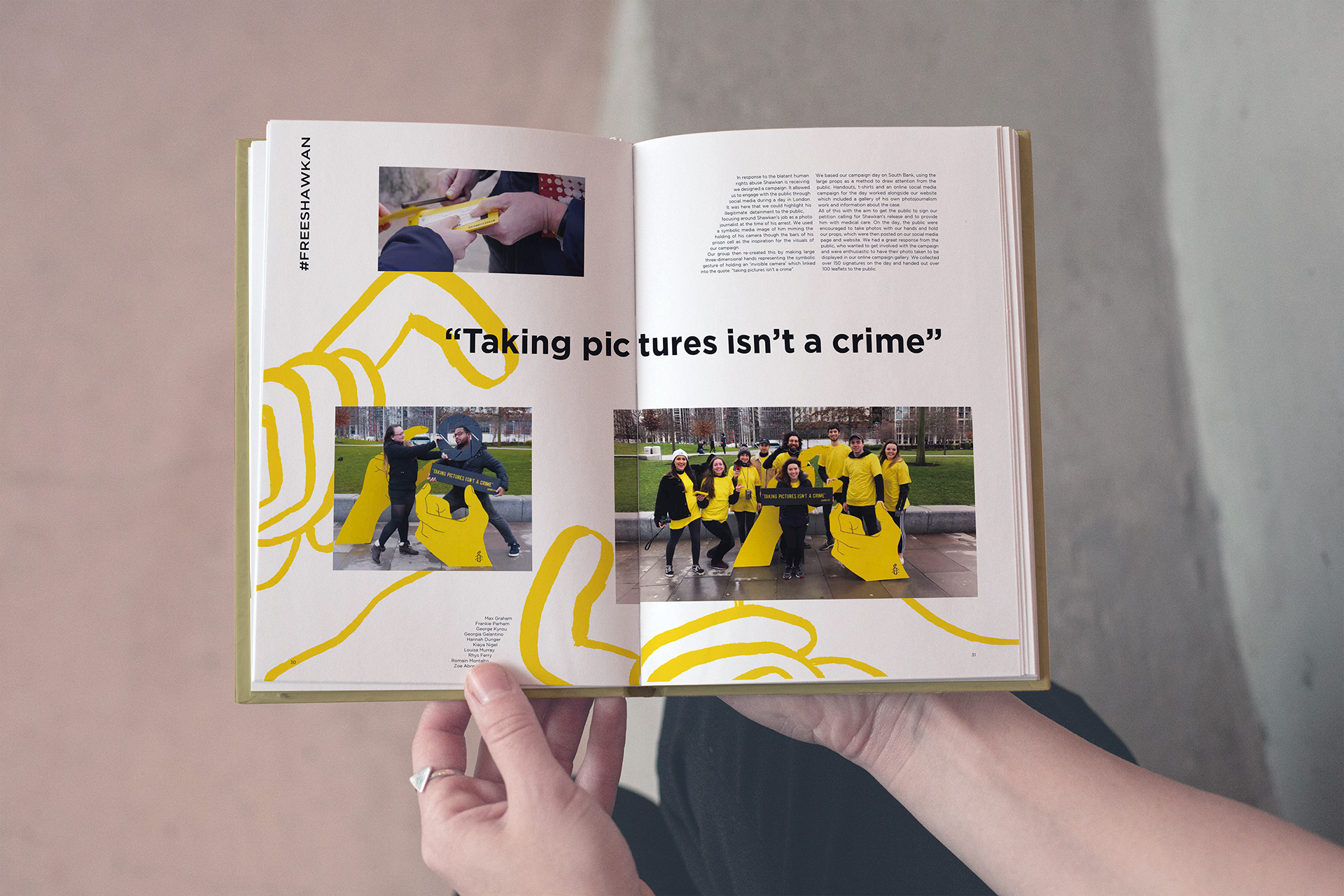
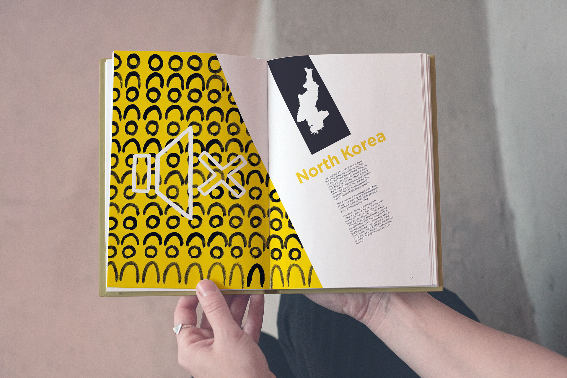
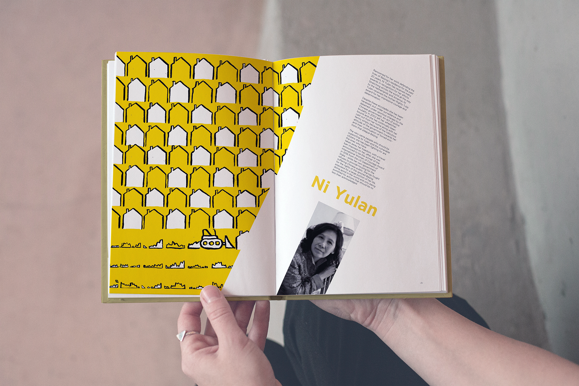
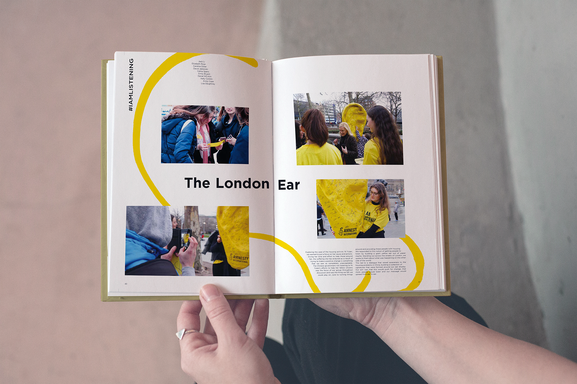
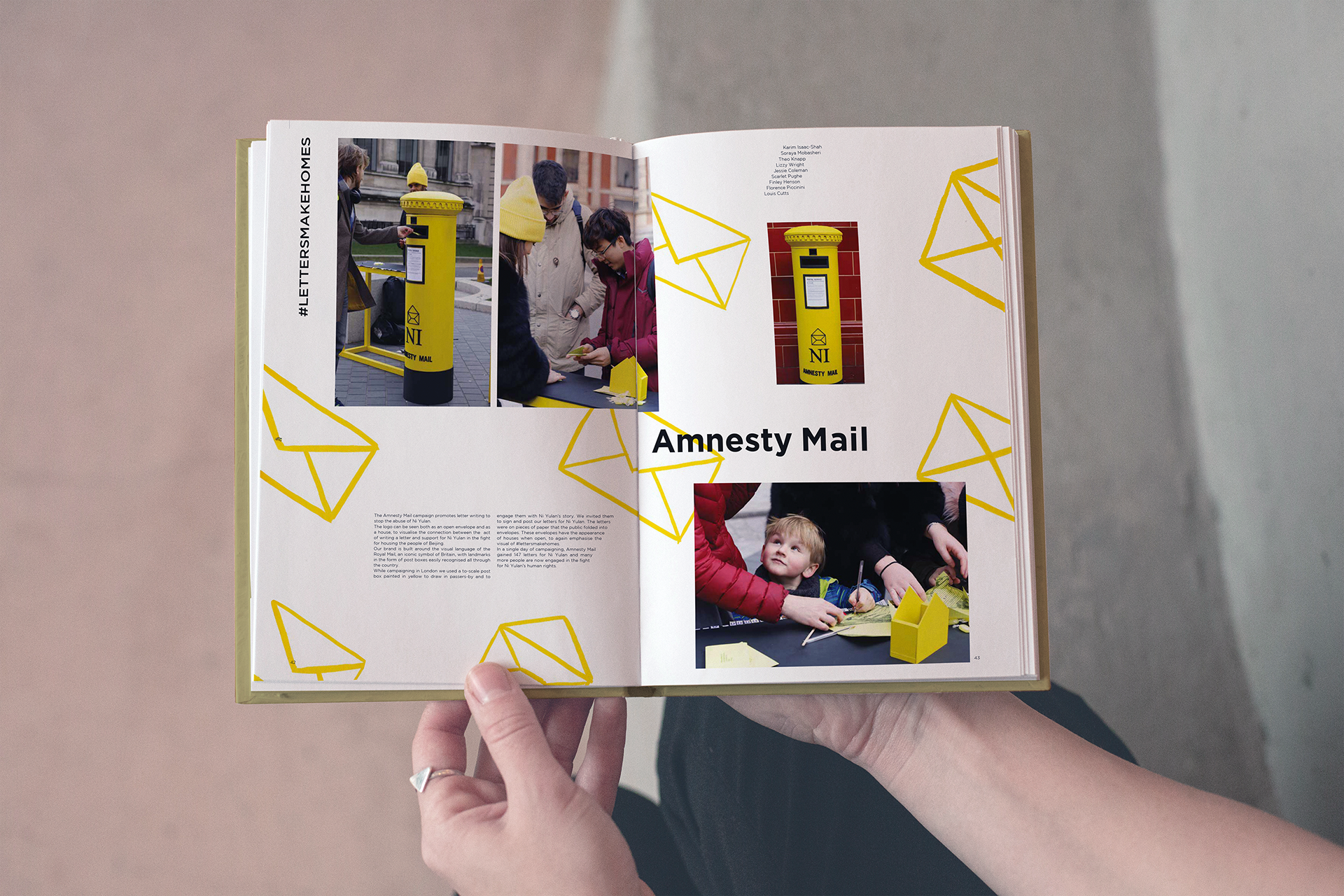
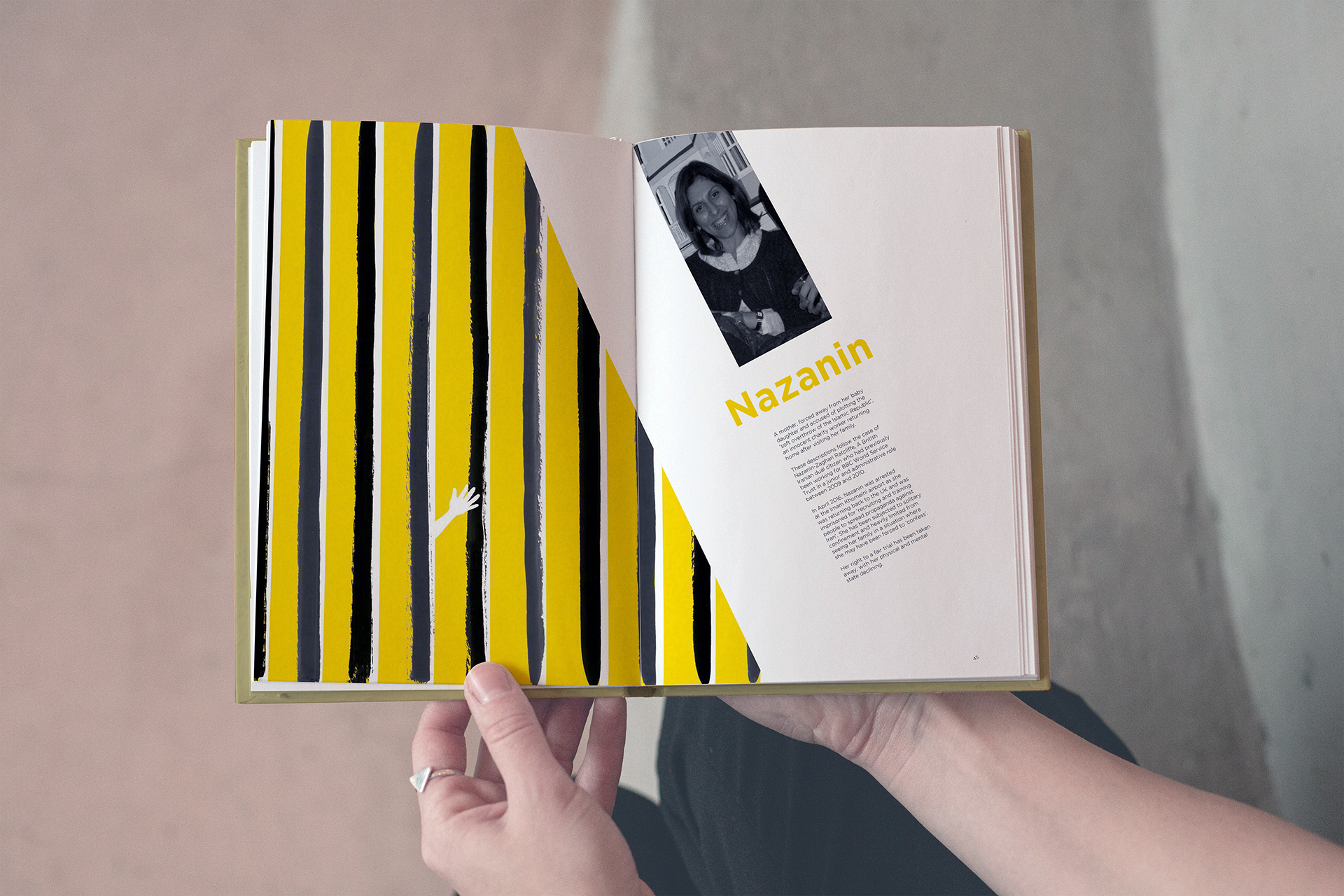
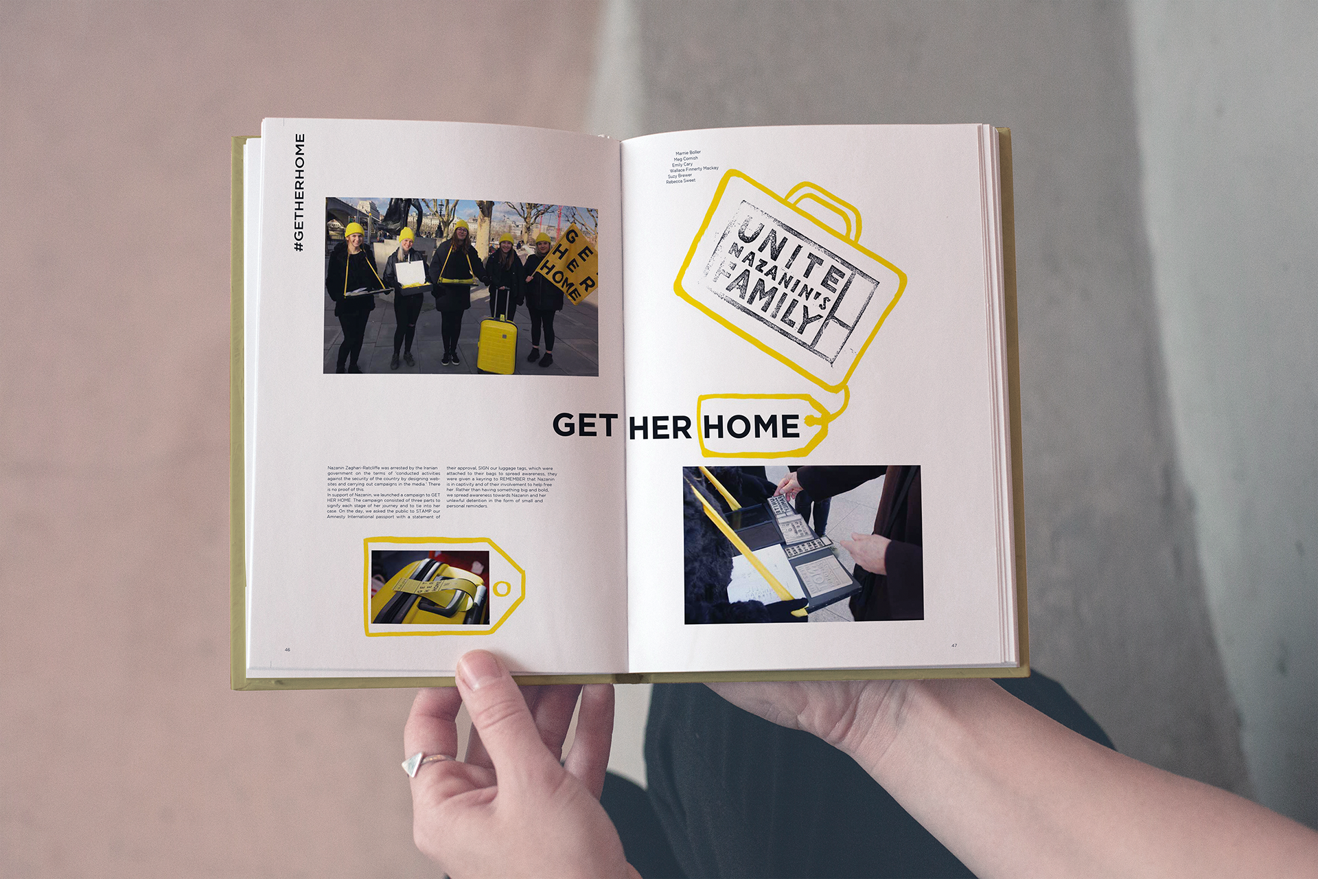
The answer came through restraint. Nicolai's illustration work was used sparingly—never as the main visual, but as an emotional undercurrent. The images supported the photography without distracting from it, serving as subtle anchors to amplify each student story.
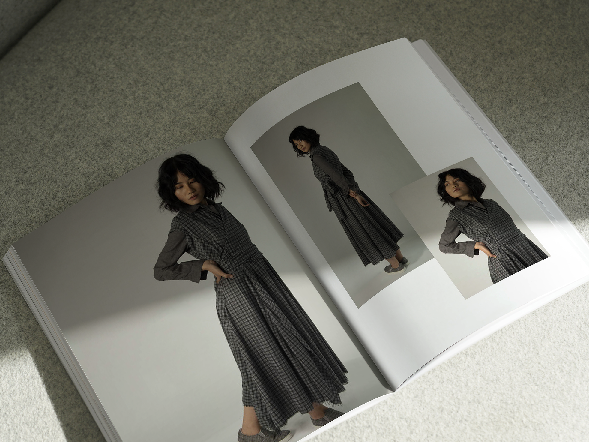
In the final stage, Alfie built a modular grid system inspired by Ernst Keller and classic Swiss editorial design. This gave the publication structure, hierarchy, and flexibility—allowing large-scale spreads to sit comfortably alongside tighter, more focused text blocks. The layout gave space for visual moments to land while keeping the reading experience fluid and organized.
The result was a thoughtful, visually cohesive publication that balanced creativity with clarity. Amnesty International responded positively, and the students saw their work represented in a way that felt both impactful and professionally realized.

Design Influenced: Ernst Keller’s modular grid systems, Swiss editorial design, emotional visual storytelling, and Amnesty International’s activist design language.
Deliverables: Editorial publication featuring student projects, including full layout design, typography system, supporting illustrations, and art direction across photography and printed media.